Optimizing a VPN funnel through behavioral insights
CRO Experiments @ CyberGhost VPN, 2022-2023
Company
CyberGhost VPN
Role
Product Designer
Team
2 Designers · CRO Team · Developers
01 — Background
CyberGhost VPN is a global VPN company focused on online privacy and security, serving millions of users worldwide. A large part of the business depended on how users moved through the pricing and checkout funnel.
This case study focuses on a series of experiments designed to improve that experience and better understand what drives hesitation before purchase. Users were reaching the pricing page, but many left without buying and we didn’t fully understand why.
My role focused on identifying behavioral patterns, translating research findings into design decisions, and designing experiments across the pricing and checkout funnel.
02 — The Problem
We were testing ideas without really understanding users
The pricing page already had ongoing optimization work and constant experimentation. But over time, the team realized something important: we were making decisions based more on assumptions than actual user behavior.
The data we relied on was outdated, and we lacked clear insight into why users reached the pricing page but didn’t complete a purchase.
Before testing new ideas, we first needed to understand what was actually creating hesitation and drop-offs in the purchase flow.
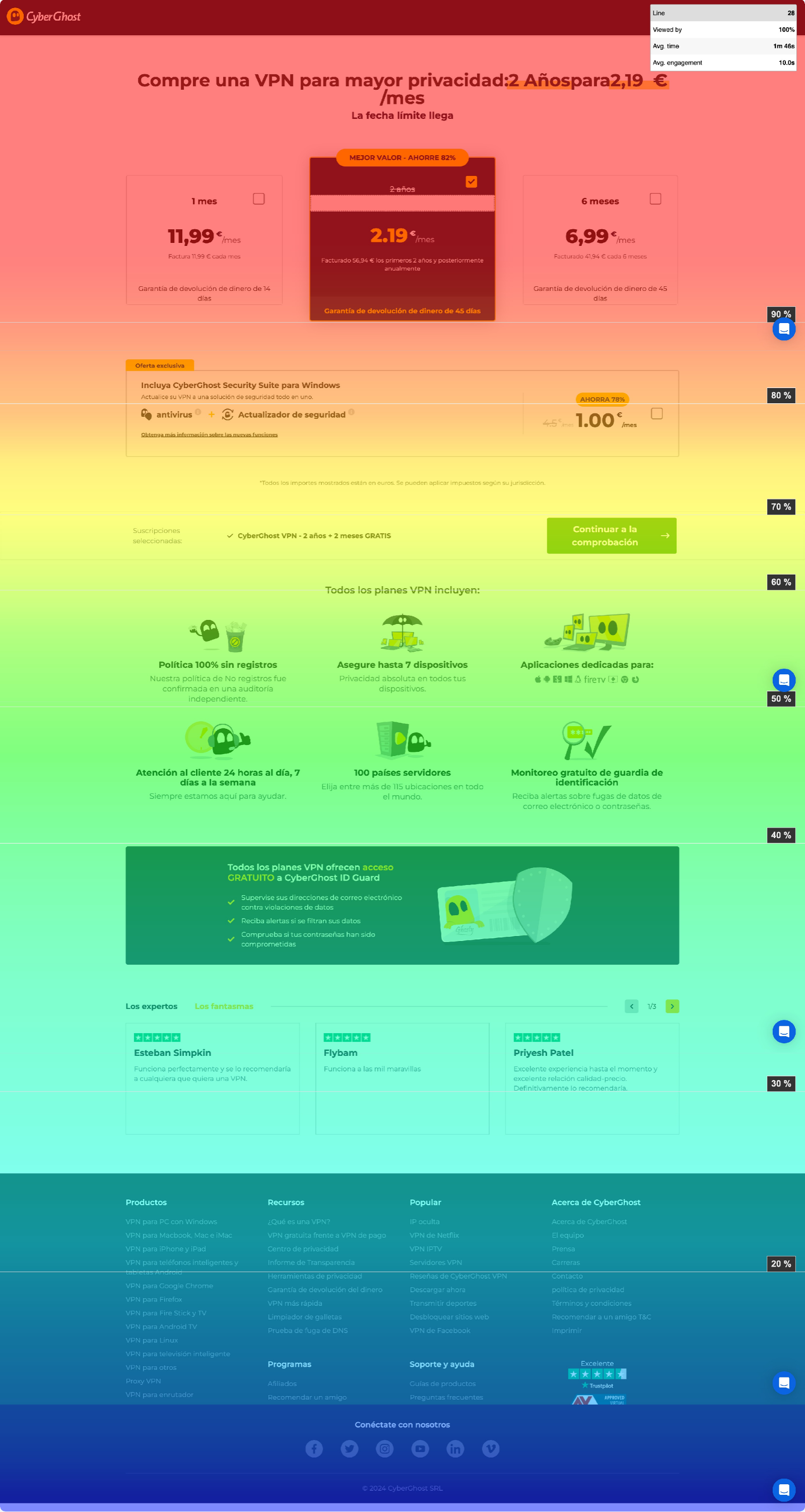
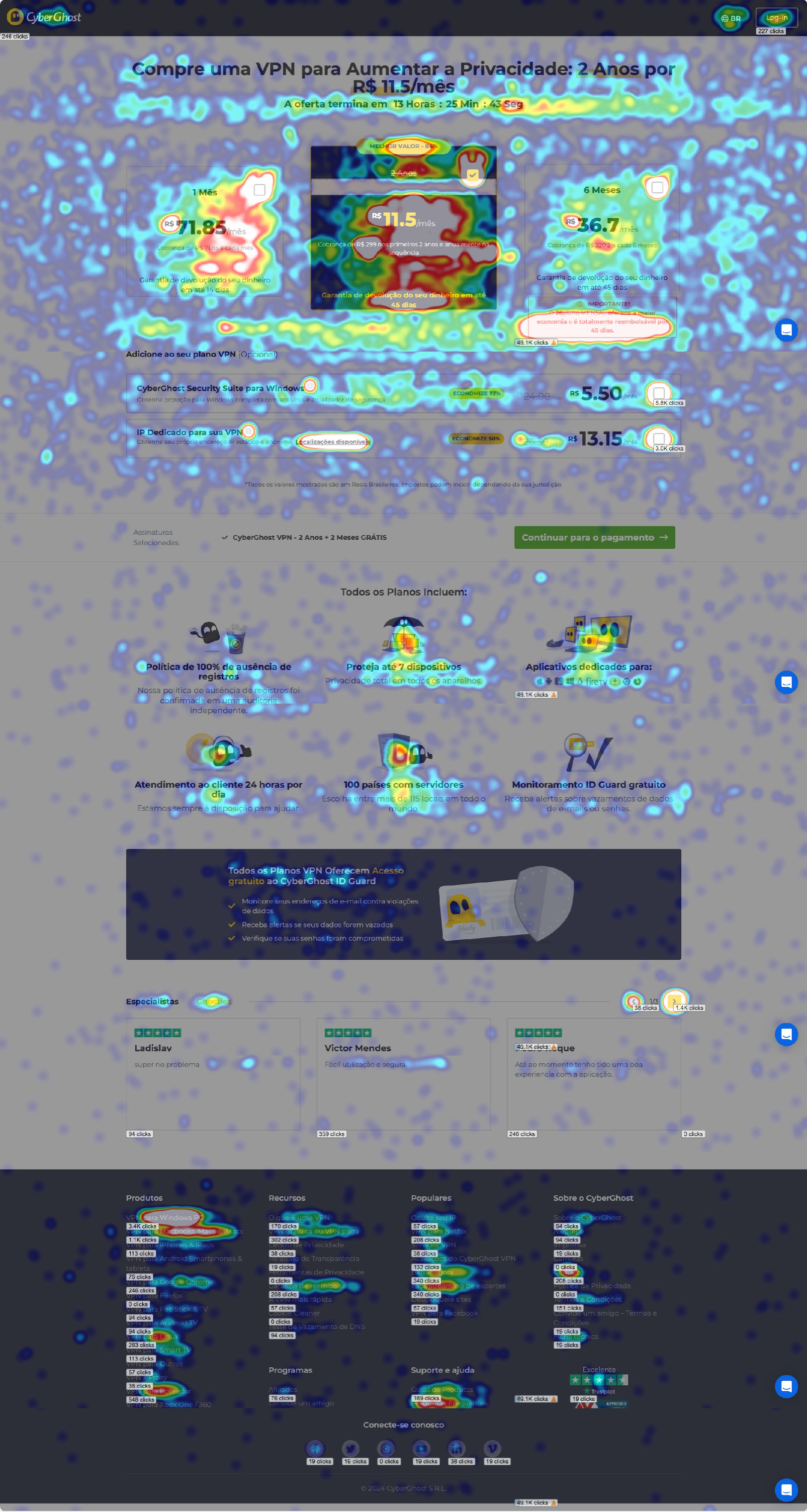
03 — Research
We started by listening to users
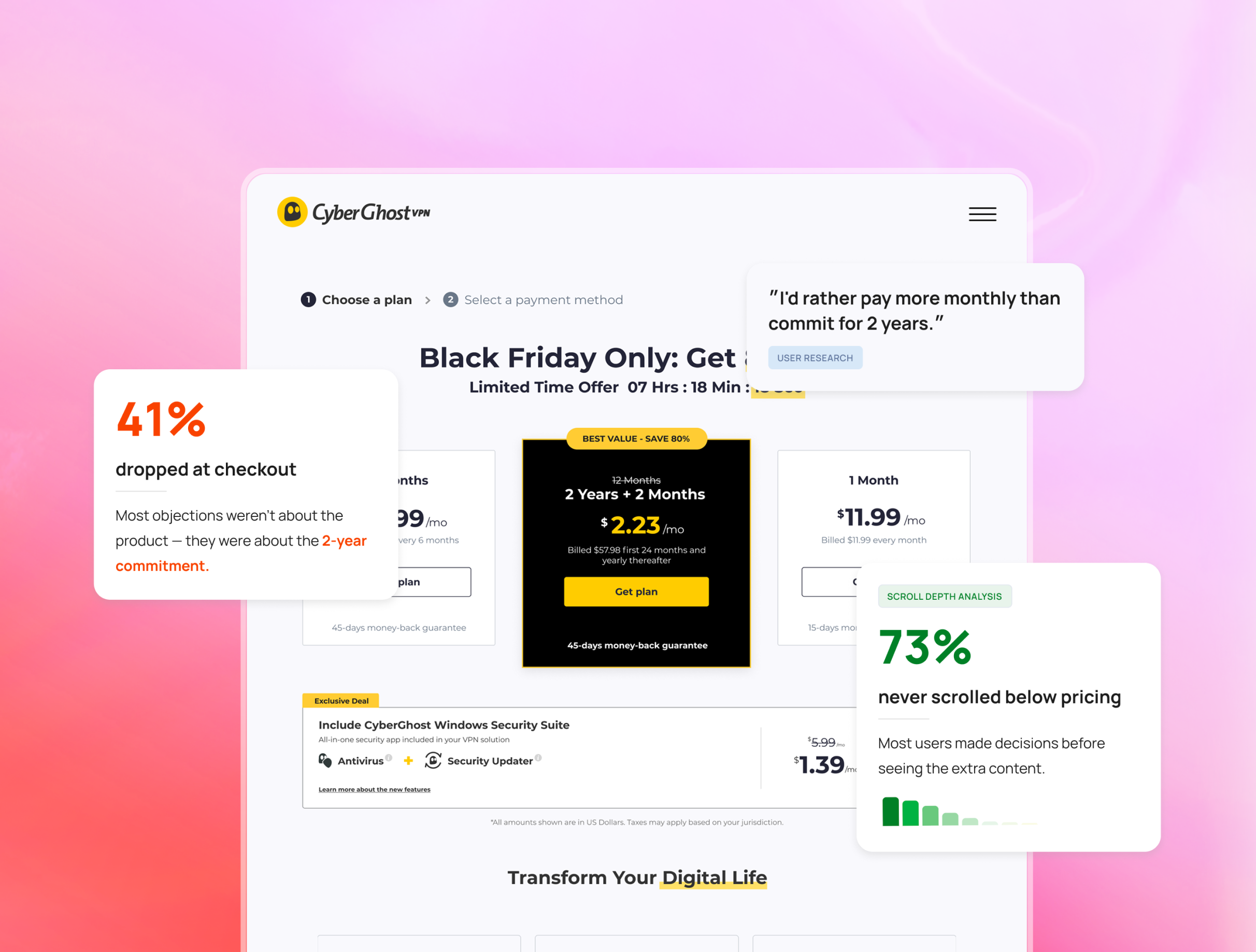
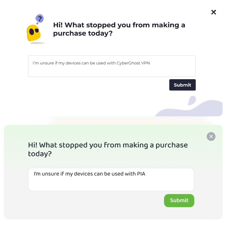
To better understand user hesitation, we launched exit-intent surveys across CyberGhost and sister brand PIA, reaching over 110,000 users across landing pages and pricing flows.
The first round used structured questions to identify recurring friction points, while the second asked one simple open question: “What made you leave without making a purchase today?”
Alongside survey responses, I analyzed heatmaps, scroll behavior, and funnel analytics to better understand how users interacted with the experience.
The research revealed recurring patterns around confusion, reassurance, and decision-making behavior across the funnel.
Responses were grouped into recurring themes and compared against behavioral analytics and heatmaps.
04 — Insights
We started by listening to users
32%
left because of price
Price was #1 — but not the way we expected
Users weren’t just saying “too expensive.” They were confused by the pricing structure — renewal costs, upfront payments, and a money-back guarantee mistaken for a free trial.
“up front payment”
“thought there was a 30 day trial”
“do not want to pay more per month”
12%
didn’t understand what they get
Users couldn’t find what they needed
Users were actively looking for information about devices, servers, and streaming support, but much of it appeared too late in the flow or was easy to miss.
“I don’t know what I get”
“Is it router compatible?”
“can’t find germany in the europe list of servers”
73%
never scrolled below pricing
Users decide fast
Most users never scrolled past the pricing cards, so many users never saw the information below.
The challenge wasn’t adding more information, but making the right information visible at the right moment.
05 — design approach
The research changed the way we approached the funnel. Instead of adding more content, we focused on making the right information visible at the right moment.
These principles guided the experiments we designed:

Make key information visible
Users often decided before reaching large parts of the page. We focused on surfacing important information earlier in the flow.

Put information where hesitation happens
Pricing details, reassurance, and product benefits performed best when placed close to the decision point.

Improve behavior, not just layouts
Instead of redesigning everything, we focused on improving weak points within patterns users already understood and trusted.
06 — The Experiments
Experiment 1 - A sticky CTA that boosted add-ons
Win
Fully implemented
Why we tested this
Users lost the checkout CTA while scrolling through the pricing page, especially on mobile. We believed keeping the CTA visible would reduce hesitation during the purchase flow.
What we changed
We introduced a sticky checkout CTA that remained visible throughout the pricing flow.
Control
CTA disappears on scroll
Variation
CTA remains visible
What happened
+19.6%
add-on purchases
+6%
average order value
The sticky CTA didn’t increase VPN plan purchases directly, which surprised us. Instead, it increased users’ confidence to continue exploring add-ons.
What we learned

Keeping the CTA visible helped users stay in the flow longer
Users were less likely to drop off when the purchase action stayed accessible
Even a small UI change affected purchase behavior
Experiment 2 - More content didn’t increase conversions
Inconclusive
Iterated
Why we tested this
Research showed that many users felt unsure about what they were actually getting. We believed adding more product benefits, visuals, and reassurance below the pricing cards would help users feel more confident before purchasing.
What we changed
We expanded the pricing page with additional benefit sections, feature highlights, screenshots, and social proof placed below the pricing cards.
Control
Short benefit section near pricing
Variation
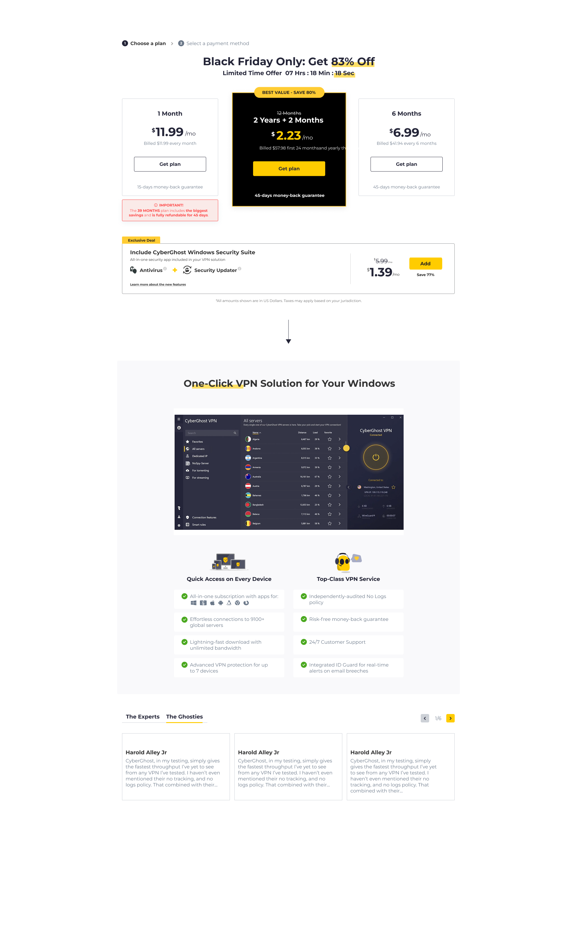

New section
Detailed product sections added below pricing
What happened
-2.5%
Overall conversion rate
Low interaction
With the new sections
The additional content didn’t improve conversions. Heatmaps showed that most users never reached the new sections.
Users weren’t asking for more content — they were asking for the right information earlier in the flow.
What we learned
Most users made decisions before reaching the new sections
Placement mattered more than content volume
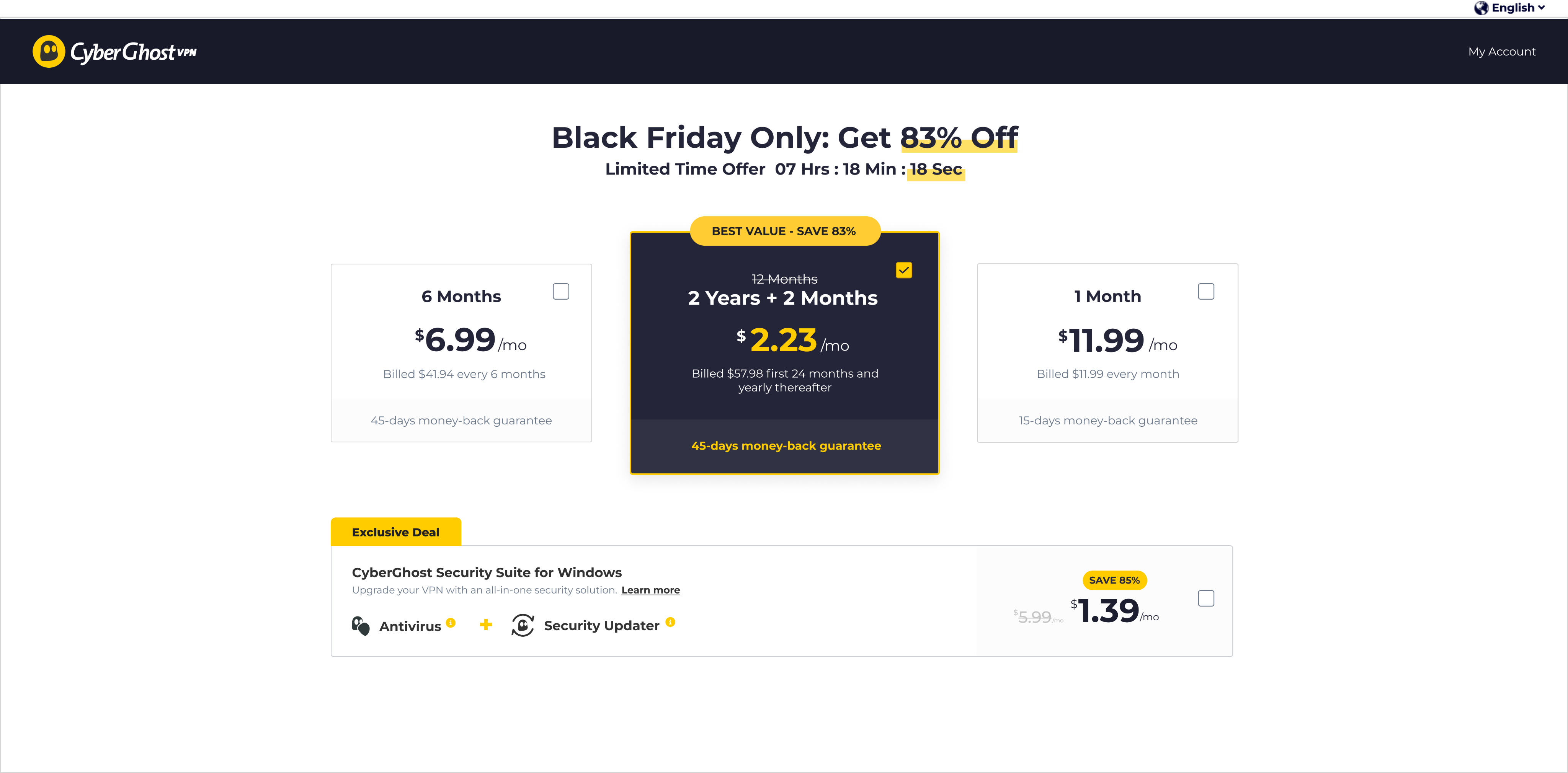
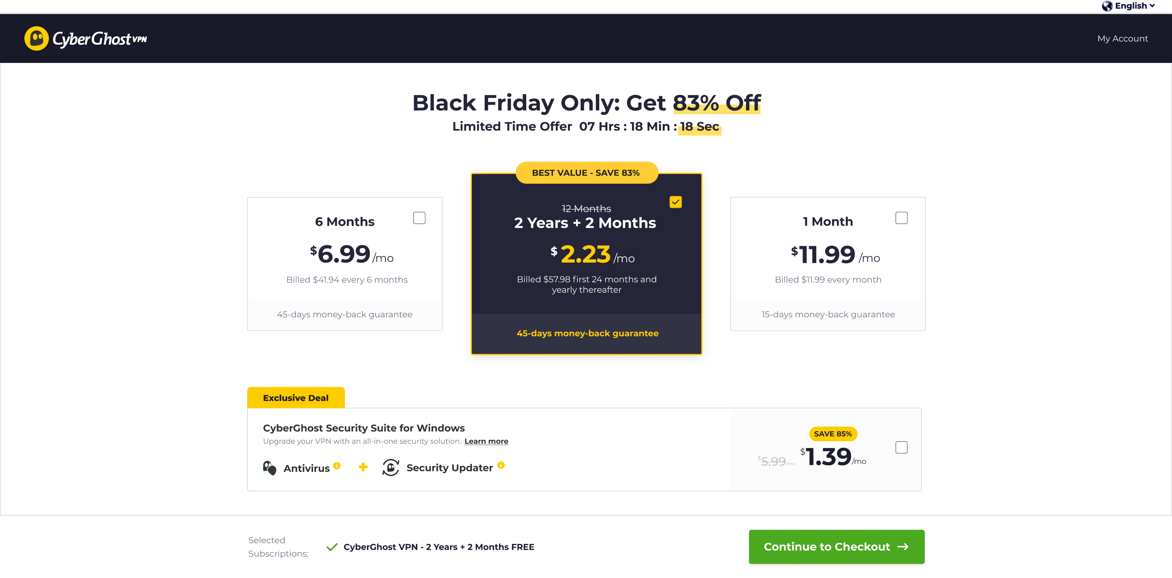
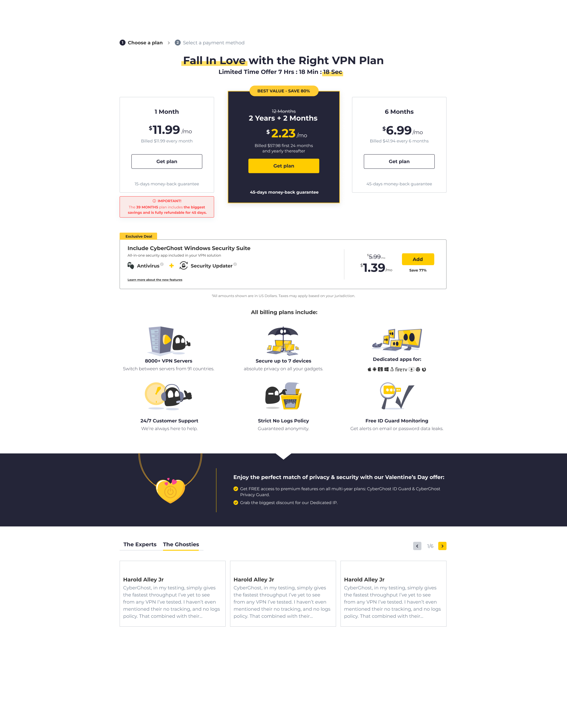
Experiment 3 - Reordering the plans hurt conversions
Lost
Abandoned
Why we tested this
We wanted to understand how much the pricing layout itself influenced decision-making. We believed reordering the plans might help users compare options more easily and choose faster.
What we changed
We moved the highlighted 2-year “best value” plan out of its central position and reordered the pricing plans in a different sequence.
Control
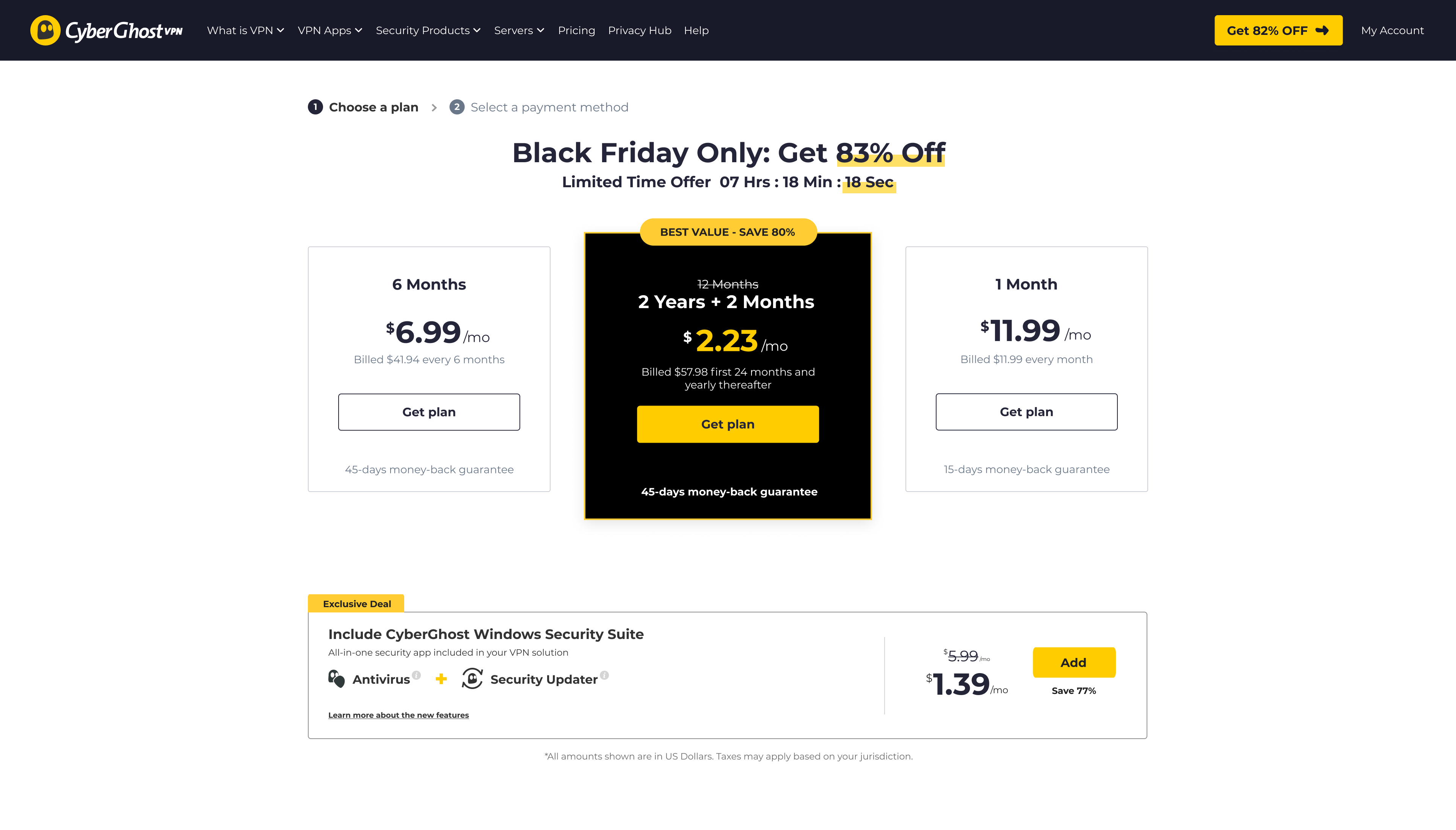
Hero plan centered
Variation
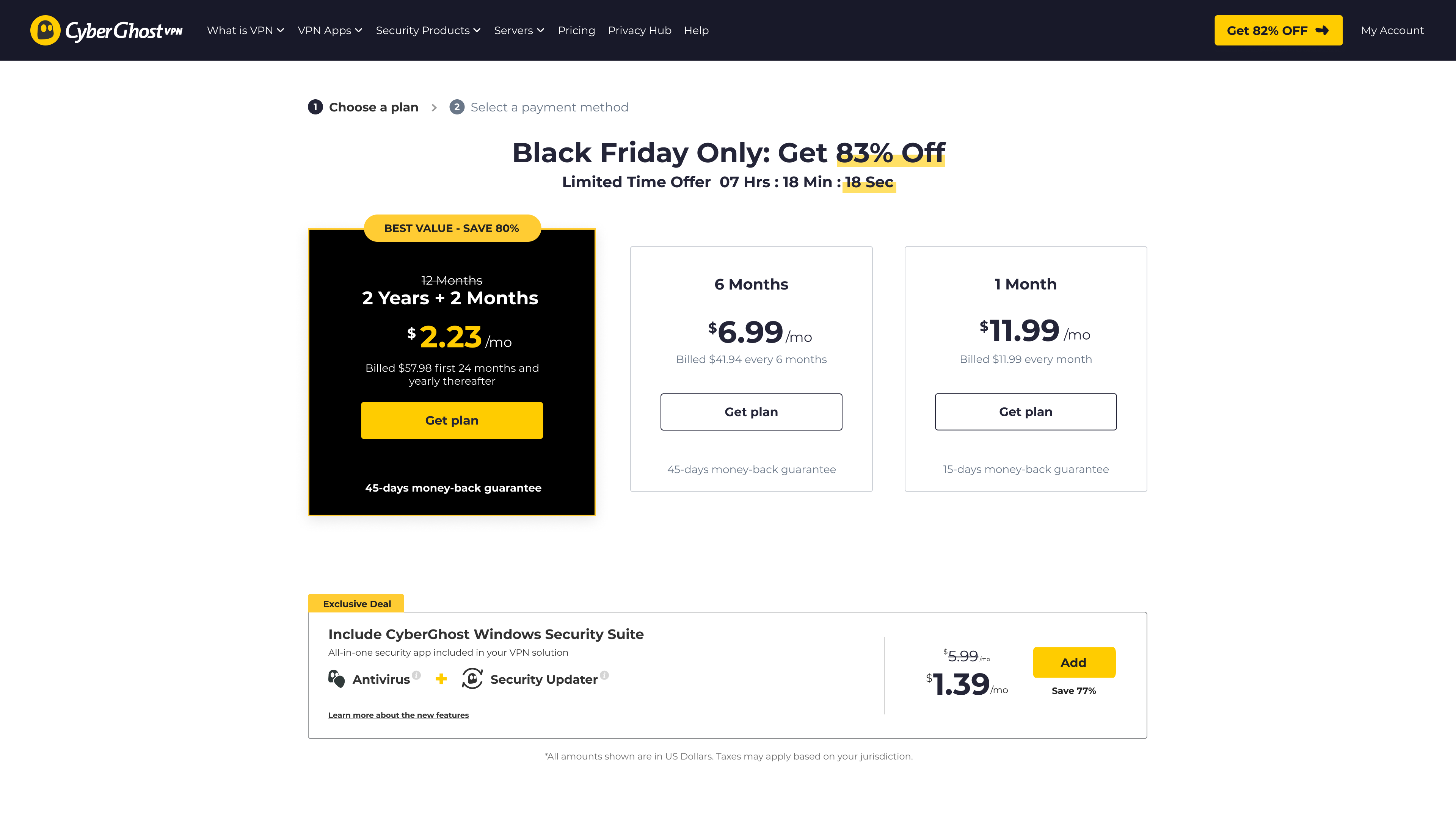
Hero plan moved from center
What happened
-17.5%
Overall conversion rate
-20%
2-year plan selection
Reordering the plans significantly hurt conversions. More users switched to shorter, cheaper plans instead of the higher-value 2-year option.
The original hierarchy wasn’t just visual styling — it was actively guiding users toward the recommended plan.
What we learned
The way plans are arranged directly affects purchasing decisions
The center position and visual emphasis strongly influenced plan selection
Even small layout changes can create major business impact
07 — Impact
The biggest impact wasn’t a single conversion uplift
it was changing how we understood user decision-making.

User behavior
Users reacted more to visibility and hierarchy than additional content

Business impact
Small layout changes directly influenced purchasing behavior and revenue

Product thinking
Decisions became more grounded in real user behavior instead of assumptions
Next Case Study

