Optimizing a VPN funnel through behavioral insights

CRO & UX Research @ CyberGhost VPN + PIA, 2023–2024

Company

CyberGhost VPN

Role

Product Designer

Team

2 Designers · CRO Team · Developers
CyberGhost CRO

01 — Background

CyberGhost VPN is a global VPN company focused on online privacy and security, serving millions of users worldwide. A large part of the business depended on how users moved through the pricing and checkout funnel.

CyberGhost VPN is a global VPN company focused on online privacy and security, serving millions of users worldwide. A large part of the business depended on how users moved through the pricing and checkout funnel.

02 — The Problem

Our test ideas were built on feedback nobody had refreshed in years.

The pricing page already had ongoing optimization work and constant experimentation. But over time, the team realized something important: we were making decisions based more on assumptions than actual user behavior.

The pricing page already had ongoing optimization work and constant experimentation. But over time, the team realized something important: we were making decisions based more on assumptions than actual user behavior.

03 — Research

We asked one question, two ways.

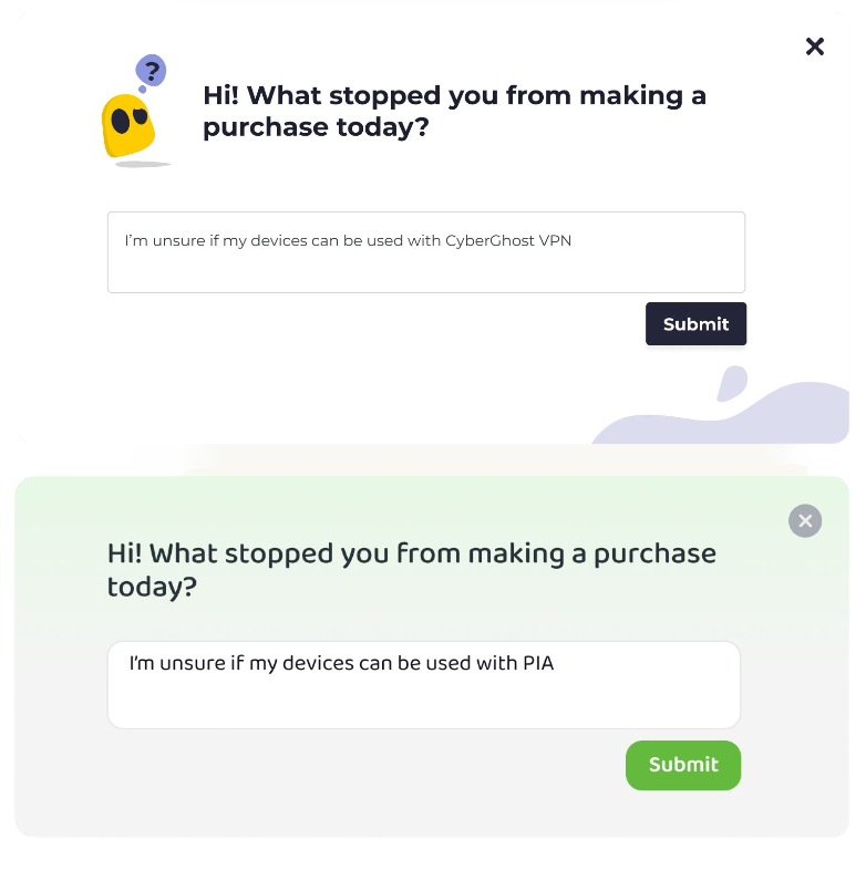
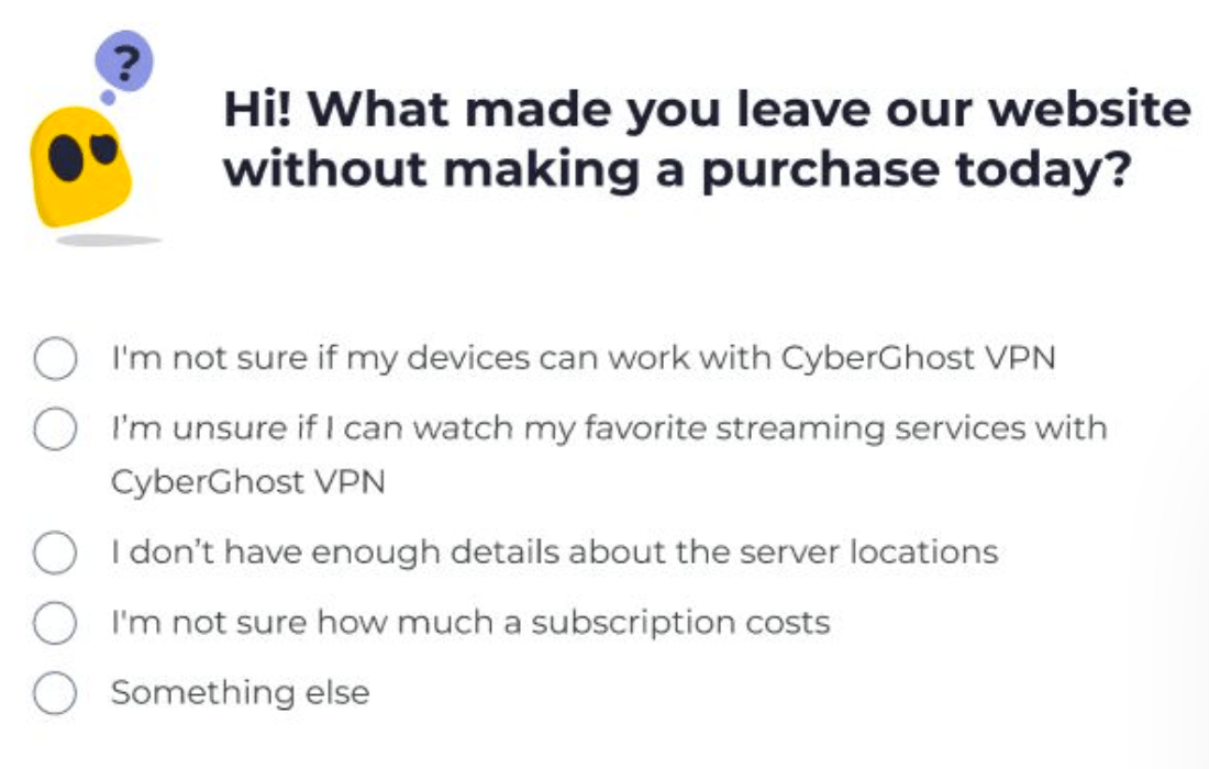
Phase 1 — Structured (April–May 2023). A two-question exit-intent survey on landing and pricing pages, across both brands: a closed list of reasons (built from our existing assumptions — devices, streaming, servers, pricing, refund) plus an optional open field.

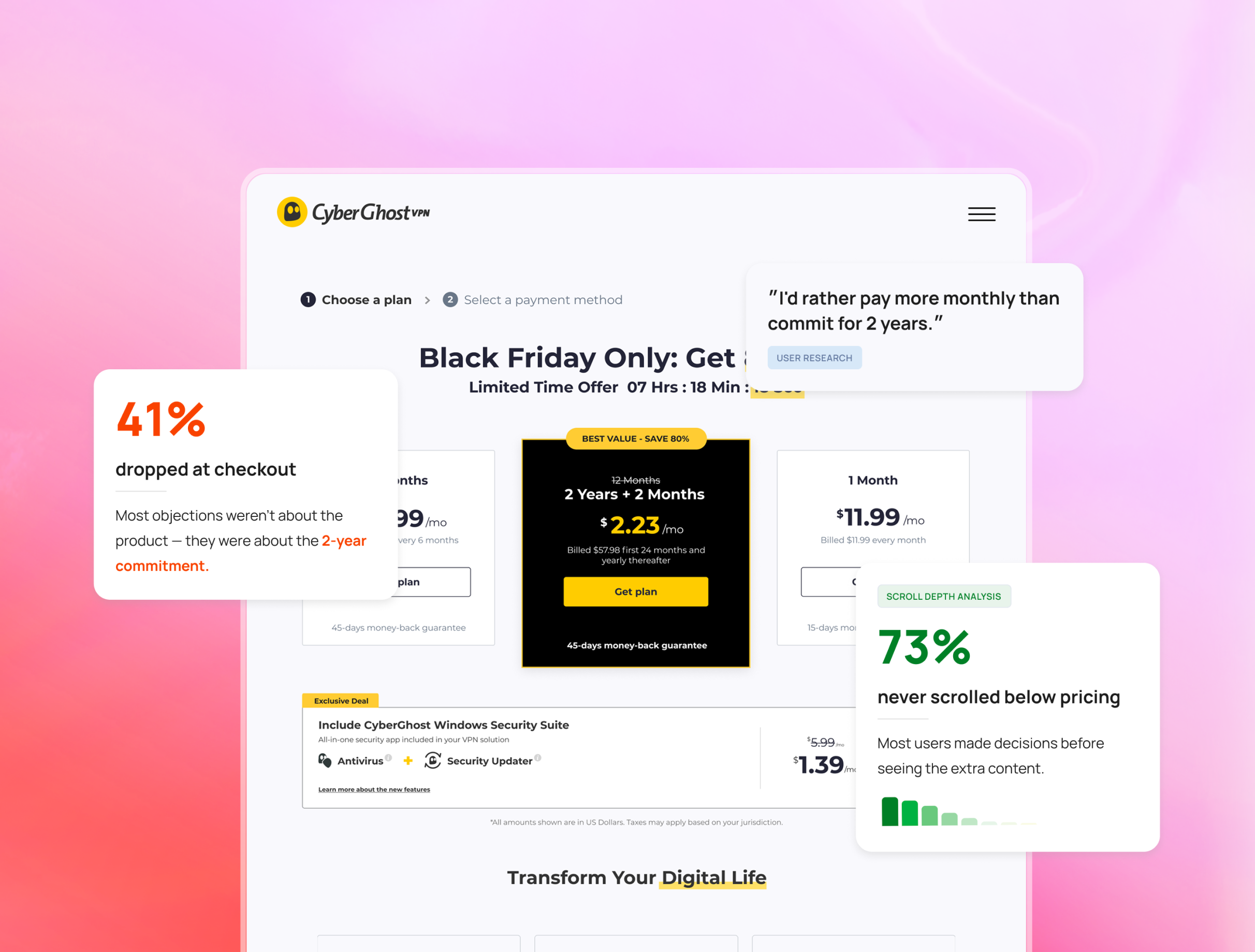
We surveyed leaving visitors on both brands — 150K saw the survey, 5,600+ answered — and compared what they said with heatmaps and analytics. The open answers showed that what we had treated as one problem was actually several different problems.
yberghost responses
yberghost responses

Round 1 — preset answers, built from our assumptions, Round 2 — one open question, no options

04 — Insights

What users said, and what their behavior showed

36%

too expensive

Price wasn’t always the problem. Confusion was.

Price was the #1 stated reason — but the open answers revealed the texture: users weren't rejecting the price, they were confused by it. Renewal costs, upfront payment for 2 years, and a 30-day money-back guarantee that many misread as a free trial. Quote: "You said no credit card and then asked me for a credit card."

"You said no credit card and then asked me for a credit card."

33%

were existing users

A third of the people who “left” were not there to buy.

Up to 33% were existing customers. They came to download the app, log in, or get support — and the sales pages gave them nowhere to go. We had been counting them as lost buyers, even though buying was never their goal.

"When I go to the homepage, where is the login button?"

73%

never scrolled below pricing

The information was on the page, but it appeared too late.

73% never scrolled past the pricing cards. The information they were looking for — servers, devices, streaming — was further down the page.

The goal became clear: Show the right information before users decide — and give existing customers a way in.

05 — From research to experiments

What we decided to test

The research gave us a clearer direction, but not one final solution. We used experiments to answer three questions:

#1

Does keeping the next step visible help users continue?

#2

The source of truth was people, not files

#3

A system built alone stays alone

The goal became clear: one source of truth, built with the team, that everyone would actually use.

06 — The Experiments

Experiment 1 - A sticky CTA that boosted add-ons

Win

Fully implemented

Why we tested this

Users lost the buy button while scrolling, especially on mobile. And since most users decide fast, the button needs to be there the moment they do.

What we changed

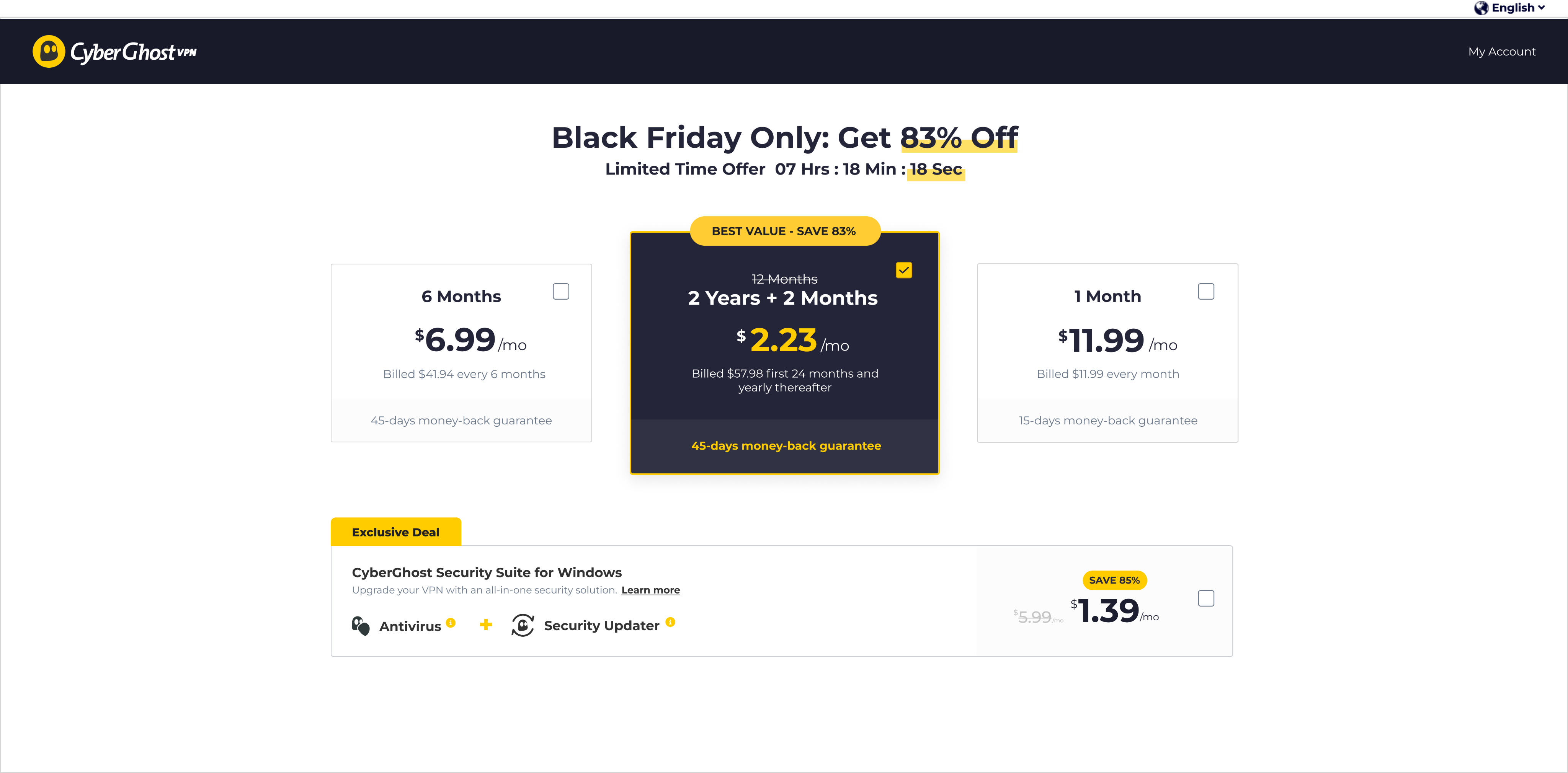
We introduced a sticky checkout CTA that remained visible throughout the pricing flow.

Control
cyberghost pricing page

CTA disappears on scroll

Variation

cyberghost pricing page

CTA remains visible

What happened

+19.6%

add-on purchases

+6%

average order value

The sticky CTA didn’t increase VPN plan purchases directly, which surprised us. Instead, it increased users’ confidence to continue exploring add-ons.

What we learned - The button wasn't blocking the purchase — it was cutting exploration short. When the buy action stays within reach, users keep browsing. Fully implemented.

Experiment 2 - More content didn’t increase conversions

Inconclusive

Why we tested this

Research showed that many users felt unsure about what they were actually getting. We believed adding more product benefits, visuals, and reassurance below the pricing cards would help users feel more confident before purchasing.

What we changed

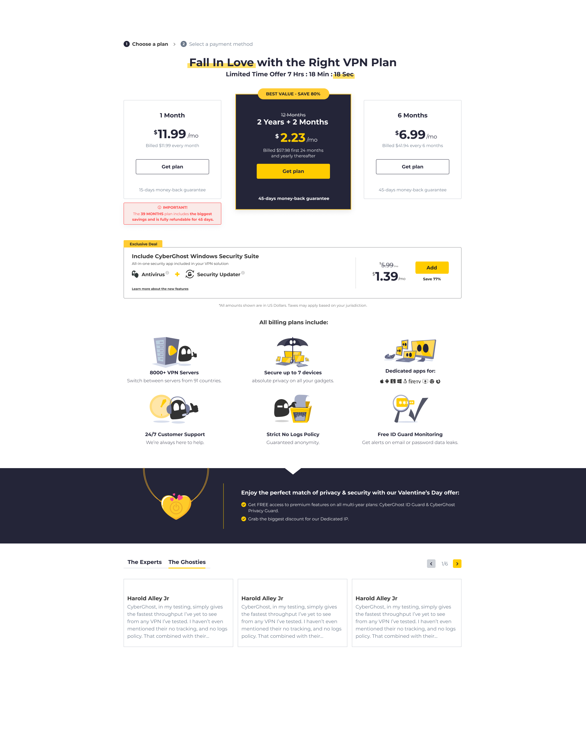
We expanded the pricing page with additional benefit sections, feature highlights, screenshots, and social proof placed below the pricing cards.

Control
cyberghost pricing page

Short benefit section near pricing

Variation
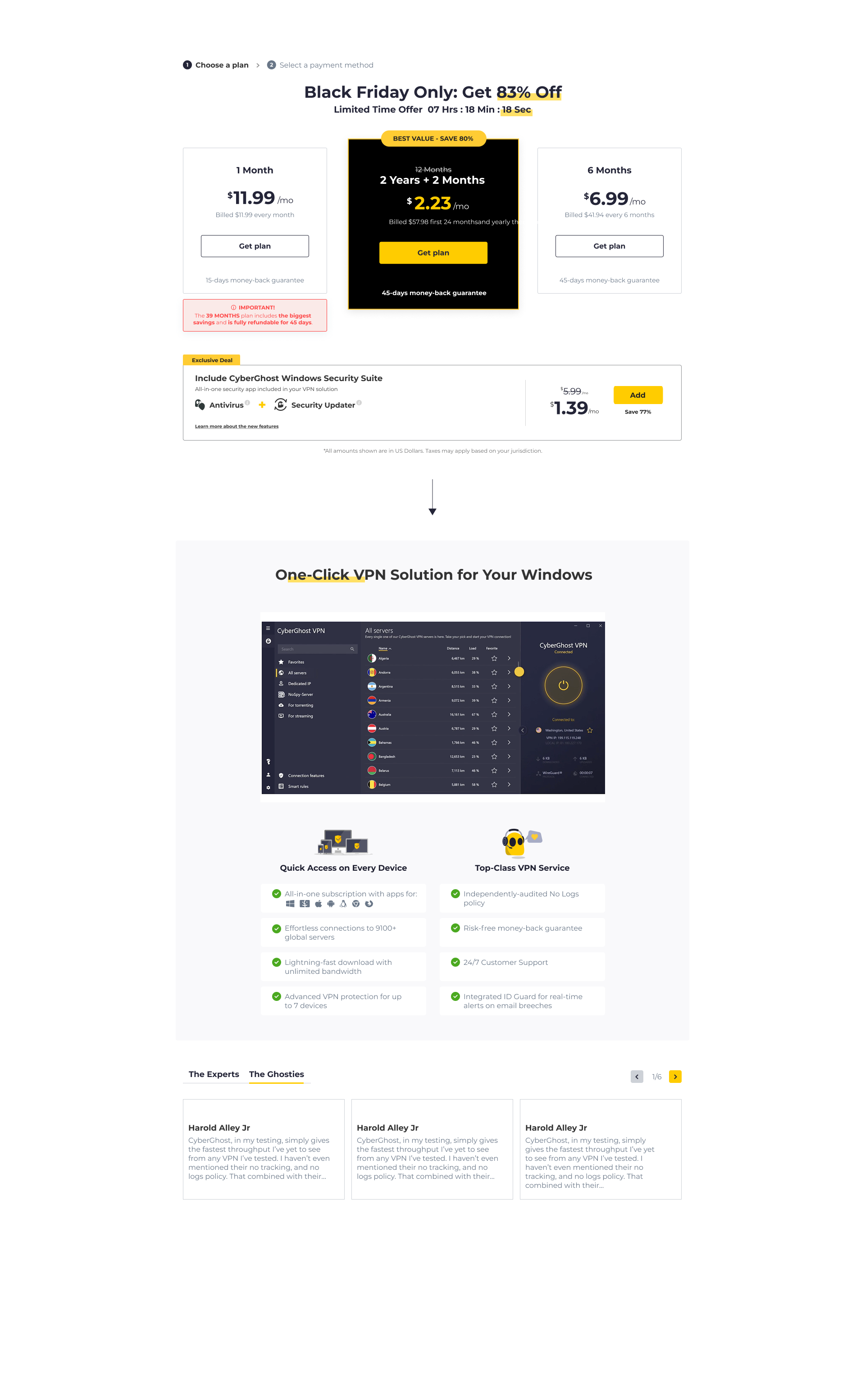
Detailed product sections added below pricing

What happened

-2.5%

Overall conversion rate

Low interaction

With the new sections

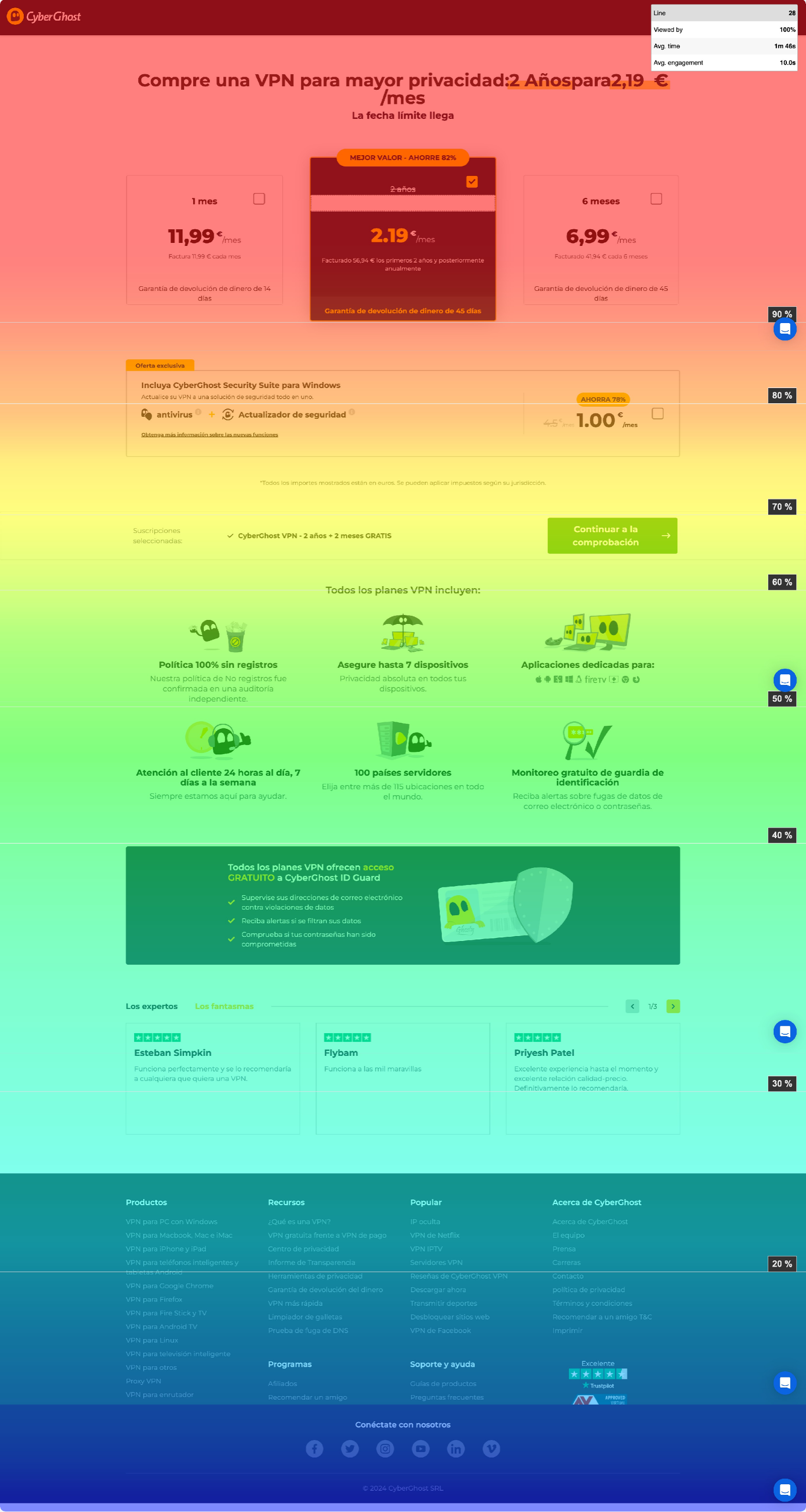
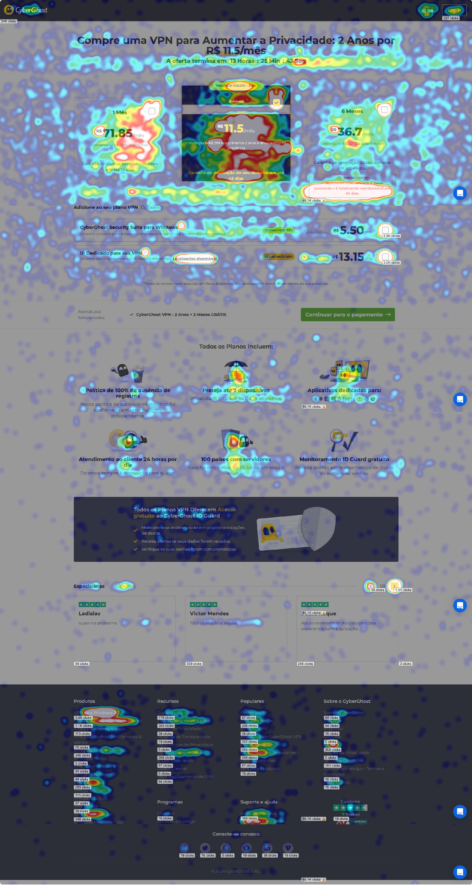
The additional content didn’t improve conversions. Heatmaps showed that most users never reached the new sections.

Users weren’t asking for more content — they were asking for the right information earlier in the flow.
cyberghost heatmap
cyberghost heatmap

What we learned - Most users never reached the new sections — the test confirmed it the hard way: placement beats volume.

Experiment 3 - Reordering the plans hurt conversions

Lost

Abandoned

Why we tested this

We wanted to understand how much the pricing layout itself influenced decision-making. We believed reordering the plans might help users compare options more easily and choose faster.

What we changed

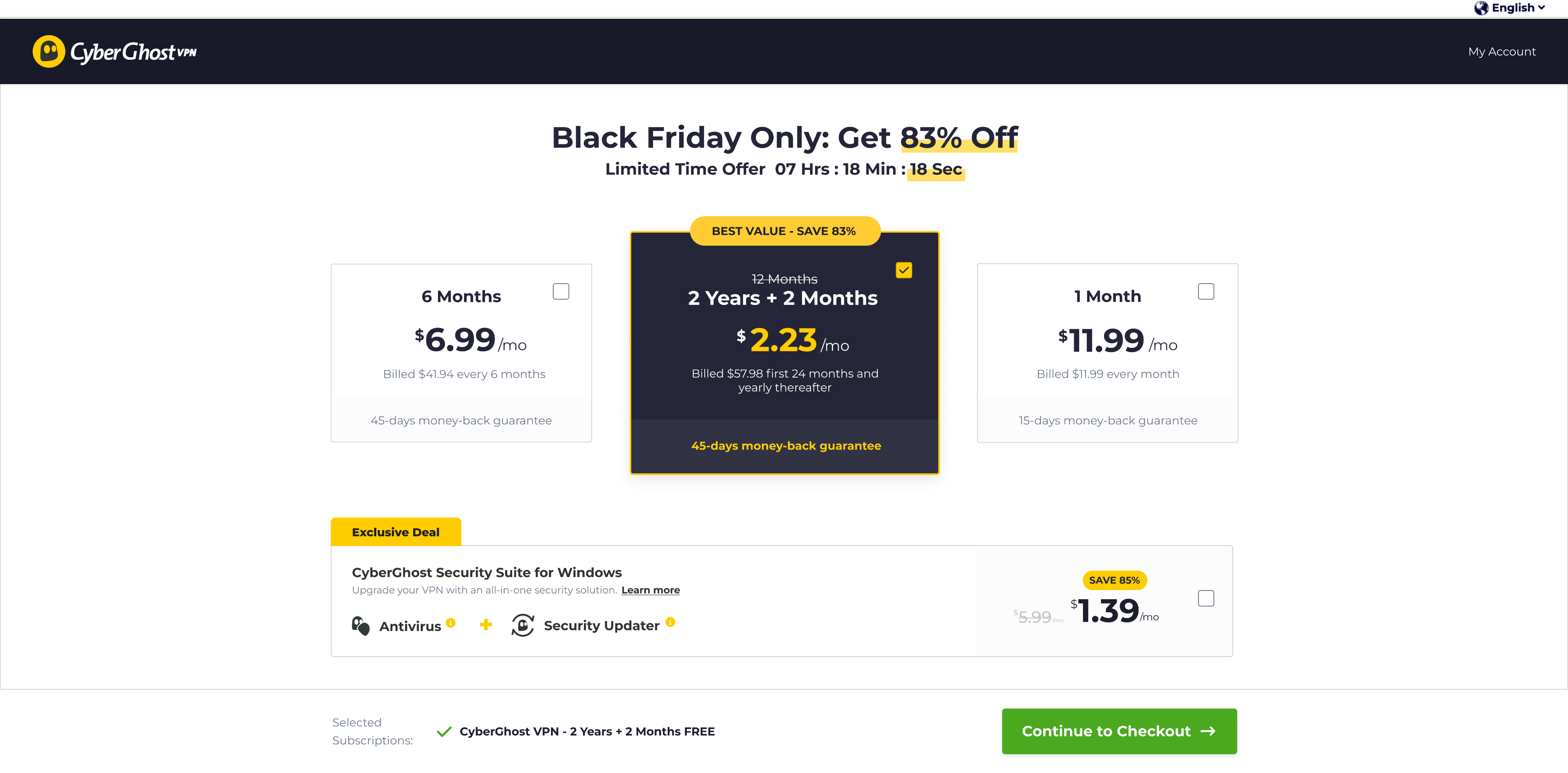
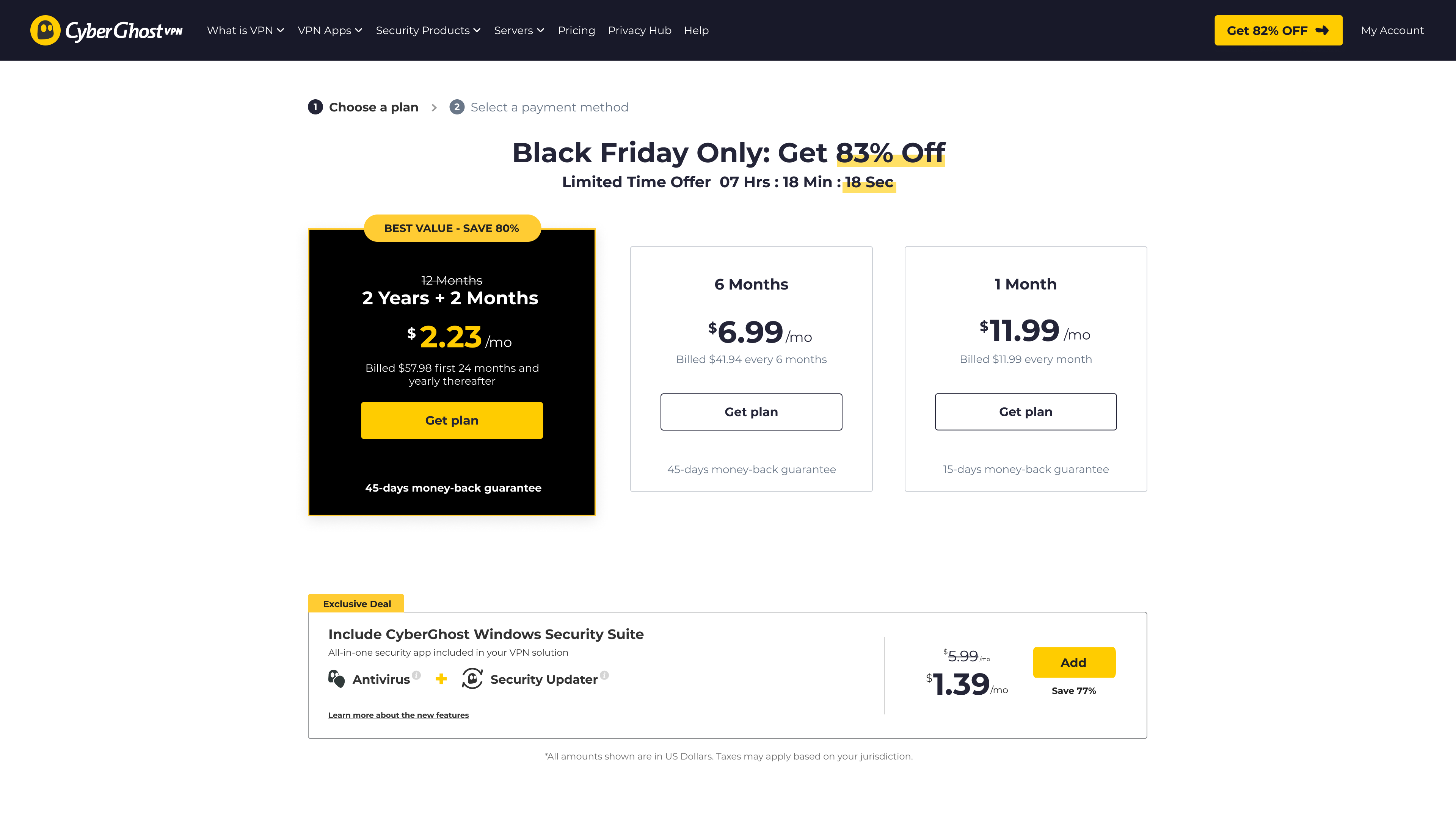
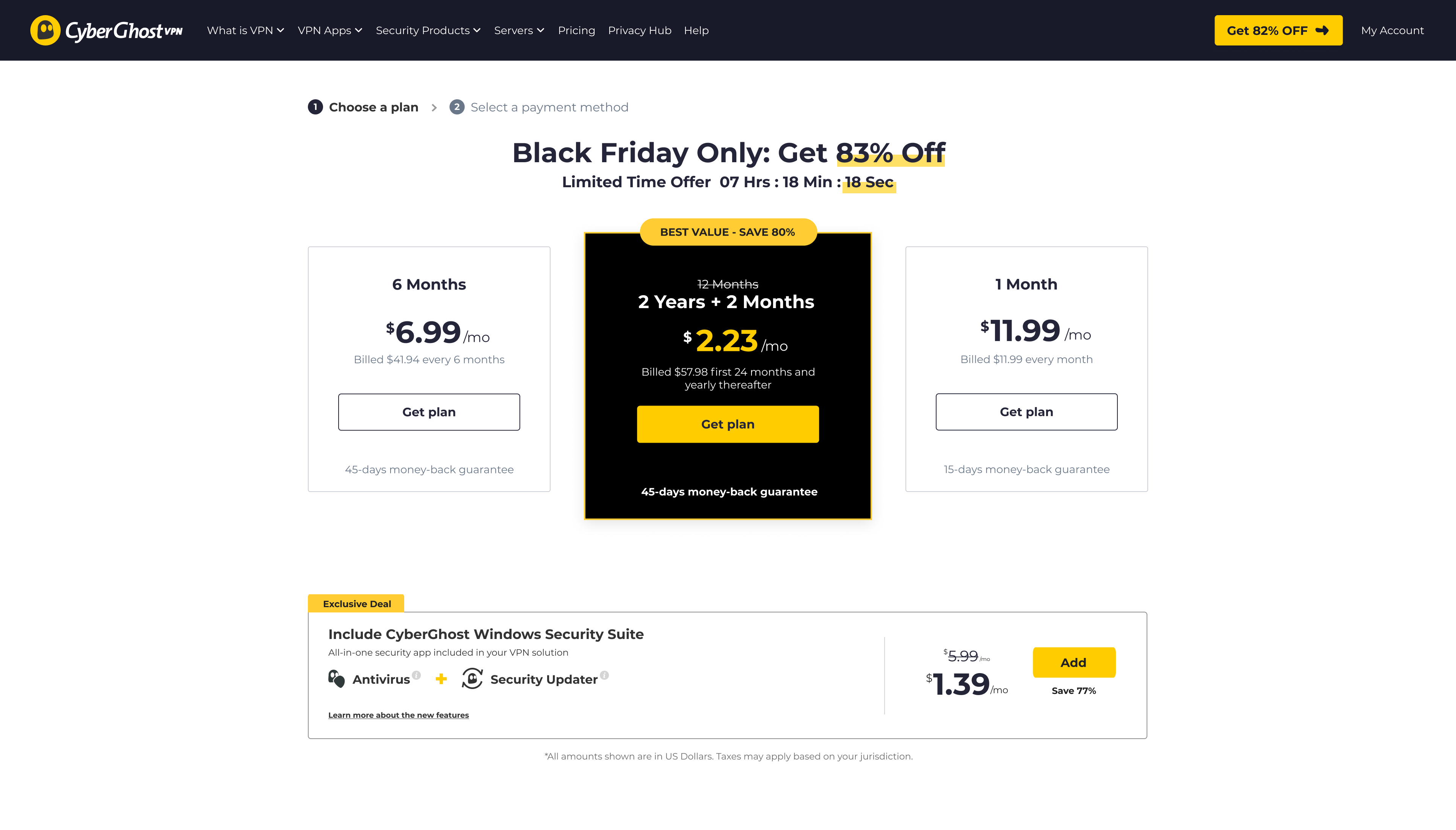
We moved the highlighted 2-year “best value” plan out of its central position and reordered the pricing plans in a different sequence.

Control
cyberghost pricing page

Hero plan centered

Variation

cyberghost pricing page

Hero plan moved from center

What happened

-17.5%

conversion

-20%

two-year plan selection

Reordering the plans significantly hurt conversions. More users switched to shorter, cheaper plans instead of the higher-value 2-year option.

The original hierarchy wasn’t just visual styling — it was actively guiding users toward the recommended plan.

What we learned - The order of the plans was helping users compare the options and find the recommended plan. Moving it changed what people chose, so we reverted the change.

07 — Impact

The biggest impact wasn’t a single conversion uplift

it was changing how we understood user decision-making.

User behavior

We understood who was actually leaving

Not every visitor who left was a lost buyer. Up to a third were existing customers with a different goal.

We protected what was already working

One losing test stopped us from rolling out a change that reduced conversion by 17.5%.

We changed what we tested

We focused on when information appeared, how easy it was to continue, and how the pricing layout affected people’s choices.

Optimizing a VPN funnel through behavioral insights

CRO & UX Research @ CyberGhost VPN + PIA, 2023–2024

Company

CyberGhost VPN

Role

Product Designer

Team

2 Designers · CRO Team · Developers

CyberGhost CRO

01 — Background

CyberGhost VPN is a global VPN company focused on online privacy and security, serving millions of users worldwide. A large part of the business depended on how users moved through the pricing and checkout funnel.

CyberGhost VPN is a global VPN company focused on online privacy and security, serving millions of users worldwide. A large part of the business depended on how users moved through the pricing and checkout funnel.

02 — The Problem

Our test ideas were built on feedback nobody had refreshed in years.

The pricing page already had ongoing optimization work and constant experimentation. But over time, the team realized something important: we were making decisions based more on assumptions than actual user behavior.

The pricing page already had ongoing optimization work and constant experimentation. But over time, the team realized something important: we were making decisions based more on assumptions than actual user behavior.

03 — Research

We asked one question, two ways.

Phase 1 — Structured (April–May 2023). A two-question exit-intent survey on landing and pricing pages, across both brands: a closed list of reasons (built from our existing assumptions — devices, streaming, servers, pricing, refund) plus an optional open field.

We surveyed leaving visitors on both brands — 150K saw the survey, 5,600+ answered — and compared what they said with heatmaps and analytics. The open answers showed that what we had treated as one problem was actually several different problems.

yberghost responses
yberghost responses

Round 1 — preset answers, built from our assumptions

Round 2 — one open question, no options

04 — Insights

What users said, and what their behavior showed

36%

too expensive

Price wasn’t always the problem. Confusion was.

Price was the #1 stated reason — but the open answers revealed the texture: users weren't rejecting the price, they were confused by it. Renewal costs, upfront payment for 2 years, and a 30-day money-back guarantee that many misread as a free trial. Quote: "You said no credit card and then asked me for a credit card."

"You said no credit card and then asked me for a credit card."

33%

were existing users

A third of the people who “left” were not there to buy.

Up to 33% were existing customers. They came to download the app, log in, or get support — and the sales pages gave them nowhere to go. We had been counting them as lost buyers, even though buying was never their goal.

"When I go to the homepage, where is the login button?"

73%

never scrolled below pricing

The information was on the page, but it appeared too late.

73% never scrolled past the pricing cards. The information they were looking for — servers, devices, streaming — was further down the page.

The goal became clear: Show the right information before users decide — and give existing customers a way in.

What we decided to test

The research gave us a clearer direction, but not one final solution. We used experiments to answer three questions:

#1

Does keeping the next step visible help users continue?

#2

The source of truth was people, not files

#3

A system built alone stays alone

The goal became clear: one source of truth, built with the team, that everyone would actually use.

06 — The Experiments

Experiment 1 - A sticky CTA that boosted add-ons

Win

Fully implemented

Why we tested this

Users lost the buy button while scrolling, especially on mobile. And since most users decide fast, the button needs to be there the moment they do.

What we changed

We introduced a sticky checkout CTA that remained visible throughout the pricing flow.

Control

cyberghost pricing page

CTA disappears on scroll

Variation

cyberghost pricing page

CTA remains visible

What happened

+19.6%

add-on purchases

+6%

average order value

The sticky CTA didn’t increase VPN plan purchases directly, which surprised us. Instead, it increased users’ confidence to continue exploring add-ons.

What we learned - The button wasn't blocking the purchase — it was cutting exploration short. When the buy action stays within reach, users keep browsing. Fully implemented.

Experiment 2 - More content didn’t increase conversions

Inconclusive

Why we tested this

Research showed that many users felt unsure about what they were actually getting. We believed adding more product benefits, visuals, and reassurance below the pricing cards would help users feel more confident before purchasing.

What we changed

We expanded the pricing page with additional benefit sections, feature highlights, screenshots, and social proof placed below the pricing cards.

Control

cyberghost pricing page

Short benefit section near pricing

Variation

New section

Detailed product sections added below pricing

What happened

-2.5%

Overall conversion rate

Low interaction

With the new sections

The additional content didn’t improve conversions. Heatmaps showed that most users never reached the new sections.

Users weren’t asking for more content — they were asking for the right information earlier in the flow.

cyberghost heatmap
cyberghost heatmap

What we learned - Most users never reached the new sections — the test confirmed it the hard way: placement beats volume.

Experiment 3 - Reordering the plans hurt conversions

Lost

Abandoned

Why we tested this

We wanted to understand how much the pricing layout itself influenced decision-making. We believed reordering the plans might help users compare options more easily and choose faster.

What we changed

We moved the highlighted 2-year “best value” plan out of its central position and reordered the pricing plans in a different sequence.

Control

cyberghost pricing page

Hero plan centered

Variation

cyberghost pricing page

Hero plan moved from center

What happened

-17.5%

conversion

-20%

two-year plan selection

Reordering the plans significantly hurt conversions. More users switched to shorter, cheaper plans instead of the higher-value 2-year option.

The original hierarchy wasn’t just visual styling — it was actively guiding users toward the recommended plan.

What we learned - The order of the plans was helping users compare the options and find the recommended plan. Moving it changed what people chose, so we reverted the change.

07 — Impact

The biggest impact wasn’t a single conversion uplift

it was changing how we understood user decision-making.

User behavior

We understood who was actually leaving

Not every visitor who left was a lost buyer. Up to a third were existing customers with a different goal.

We protected what was already working

One losing test stopped us from rolling out a change that reduced conversion by 17.5%.

We changed what we tested

We focused on when information appeared, how easy it was to continue, and how the pricing layout affected people’s choices.

Optimizing a VPN funnel through behavioral insights

CRO & UX Research @ CyberGhost VPN + PIA, 2023–2024

Company

CyberGhost VPN

Role

Product Designer

Team

2 Designers · CRO Team · Developers

CyberGhost CRO

01 — Background

CyberGhost VPN and Private Internet Access (PIA) are two global privacy brands under the same group. A large share of the business runs through one funnel: landing pages → pricing → checkout.

The funnel was under constant experimentation — the WebCRO team ran multiple tests every quarter. My role: research design, identifying behavioral patterns, and translating findings into experiment hypotheses and designs.

02 — The Problem

Our test ideas were built on feedback nobody had refreshed in years.

The experiment backlog was full — ideas from best practices, past wins, competitor moves. But the user feedback behind our hypotheses was outdated: the market had changed, pricing had changed, and we no longer knew the answer to the most basic question — why do people reach our pages and leave without buying?

Before designing another test, we decided to ask them directly.

03 — Research

We asked one question, two ways.

We asked in two rounds. First, a survey with preset answers — built from what we already believed. Then, a single open question with no options at all: "What made you leave without buying today?" The first round tested the reasons we already had in mind. The second gave users room to tell us what we had missed.

We surveyed leaving visitors on both brands — 150K saw the survey, 5,600+ answered — and compared what they said with heatmaps and analytics. The open answers showed that what we had treated as one problem was actually several different problems.

yberghost responses
yberghost responses

Round 1 — preset answers, built from our assumptions

Round 2 — one open question, no options

04 — Insights

What users said, and what their behavior showed

36%

too expensive

Price wasn’t always the problem. Confusion was.

36% said the product was too expensive. But the open answers showed that price was not always the only issue. Many users didn’t understand the renewal price, the upfront payment, or the refund policy — and some thought it was a free trial.

"You said no credit card and then asked me for a credit card."

33%

were existing users

A third of the people who “left” were not there to buy.

Up to 33% were existing customers. They came to download the app, log in, or get support — and the sales pages gave them nowhere to go. We had been counting them as lost buyers, even though buying was never their goal.

"When I go to the homepage, where is the login button?"

73%

never scrolled below pricing

The information was on the page, but it appeared too late.

73% never scrolled past the pricing cards. The information they were looking for — servers, devices, streaming — was further down the page.

The goal became clear: Show the right information before users decide — and give existing customers a way in.

05 — From research to experiments

What we decided to test

The research gave us a clearer direction, but not one final solution. We used experiments to answer three questions:

#1

Does keeping the next step visible help users continue?

#2

Do users need more information, or do they need it earlier?

#3

Does the order of the pricing plans affect what people choose?

These questions became the three experiments below.

06 — The Experiments

Experiment 1 - A sticky CTA that boosted add-ons

Win

Fully implemented

Why we tested this

Users lost the buy button while scrolling, especially on mobile. And since most users decide fast, the button needs to be there the moment they do.

What we changed

We introduced a sticky checkout CTA that remained visible throughout the pricing flow.

Control

cyberghost pricing page

CTA disappears on scroll

Variation

cyberghost pricing page

CTA remains visible

What happened

+19.6%

add-on purchases

+6%

average order value

The sticky CTA didn’t increase VPN plan purchases directly, which surprised us. Instead, more users continued to explore and purchase add-ons.

What we learned - The button wasn't blocking the purchase — it was cutting exploration short. When the buy action stays within reach, users keep browsing. Fully implemented.

Experiment 2 - More content didn’t increase conversions

Inconclusive

Why we tested this

Before moving information up, we tested the opposite instinct first: what if we just added more content where it was?Research showed that many users felt unsure about what they were actually getting. We believed adding more product benefits, visuals, and reassurance below the pricing cards would help users feel more confident before purchasing.

What we changed

We expanded the pricing page with additional benefit sections, feature highlights, screenshots, and social proof placed below the pricing cards.

Control

cyberghost pricing page

Short benefit section near pricing

Variation

New section

Detailed product sections added below pricing

What happened

-2.5%

Overall conversion rate

Low interaction

With the new sections

The additional content didn’t improve conversions. Heatmaps showed that most users never reached the new sections.

Users weren’t asking for more content — they were asking for the right information earlier in the flow.

cyberghost heatmap
cyberghost heatmap

What we learned - The information needed to appear earlier, not further down the page.

Experiment 3 - Reordering the plans hurt conversions

Lost

Abandoned

Why we tested this

After seeing that most users made their decision around pricing, we wanted to understand how much the pricing layout itself influenced what they chose.

What we changed

We moved the highlighted 2-year “best value” plan out of its central position and reordered the pricing plans in a different sequence.

Control

cyberghost pricing page

Hero plan centered

Variation

cyberghost pricing page

Hero plan moved from center

What happened

-17.5%

conversion

-20%

two-year plan selection

Reordering the plans significantly hurt conversions. More users switched to shorter, cheaper plans instead of the higher-value 2-year option.

The original hierarchy wasn’t just visual styling — it was actively guiding users toward the recommended plan.

What we learned - The order of the plans was helping users compare the options and find the recommended plan. Moving it changed what people chose, so we reverted the change.

07 — Impact

The biggest impact wasn’t a single conversion uplift

it was changing how we understood user decision-making.

User behavior

We understood who was actually leaving

Not every visitor who left was a lost buyer. Up to a third were existing customers with a different goal.

We protected what was already working

One losing test stopped us from rolling out a change that reduced conversion by 17.5%.

We changed what we tested

We focused on when information appeared, how easy it was to continue, and how the pricing layout affected people’s choices.