Building a Design System for PIA
Company
Private Internet Access
Role
Product Designer
Team
3 Designers
01 — Background
Private Internet Access had a large marketing website made up of landing pages, pricing pages, comparison pages, and campaign experiences.
As the website evolved, new pages were added, experiments were launched, and different designers contributed over time. The result was a growing collection of patterns that looked similar but behaved differently.
What started as small inconsistencies eventually became a scalability problem.
02 — The Problem
We weren’t designing from a system. We were designing from old files.
When building a new page, designers rarely started from a shared library. Instead, the process usually looked like this:
Search for a similar page → Copy an existing section→ Adjust it for the new use case→Repeat
Over time, this created dozens of slightly different versions of the same components.
As a result:
- Similar pages looked different
- Components were recreated repeatedly
- Design decisions became harder to maintain
- New designers had no clear source of truth
The website continued to grow, but the design process wasn’t scaling with it.
03 — Research
Before designing anything, we audited the website to understand what was actually being used across pages.
+5
Button Styles
Same action, different look on every page
5
Table Layouts
Each comparison table designed from scratch
7
Feature Card Variations
Same pattern, completely different executions
+4
Illustration Styles
3D, flat, outline — mixed across the site
Research findings
Buttons — 5+ styles for the same action


Tables — 5 different comparison layouts
Feature cards — 7 variations of the same pattern
Icons & Illustrations — 4+ visual styles mixed together


The inconsistencies weren’t isolated. They existed across every layer of the experience.
04 — Insights
We started by listening to users
A design system already existed, but it no longer reflected the live website. Some components were implemented, others existed only in Figma, and many had evolved independently over time.
As a result, there was no clear source of truth. Designers spent time figuring out what could actually be reused, often relying on the website instead of the system.
That insight changed our approach. Instead of building a new design system, we focused on creating one the team could trust and use with confidence.
05 — design approach
We started by listening to users
We didn't set out to redesign the website. The visual language mostly worked — the problem was inconsistency, not bad design. So we set three rules for ourselves:

Adopt what works
components already used across most pages became the standard

Reduce, don't add
eliminate unnecessary variations before creating anything new

Change only what's broken
if something was consistent and functional, we left it alone
Every addition to the system had to solve a real, recurring problem — not just look better.
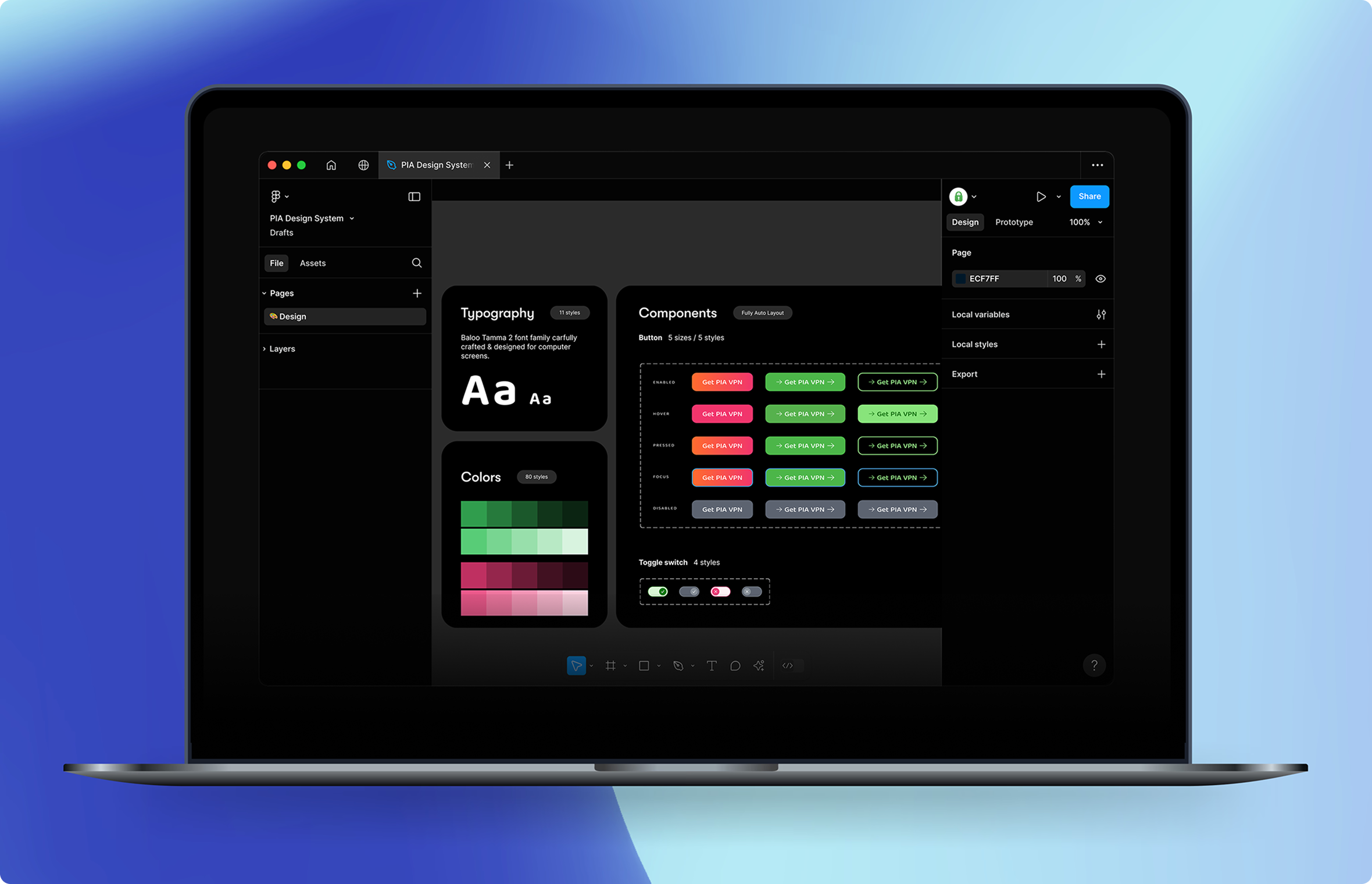
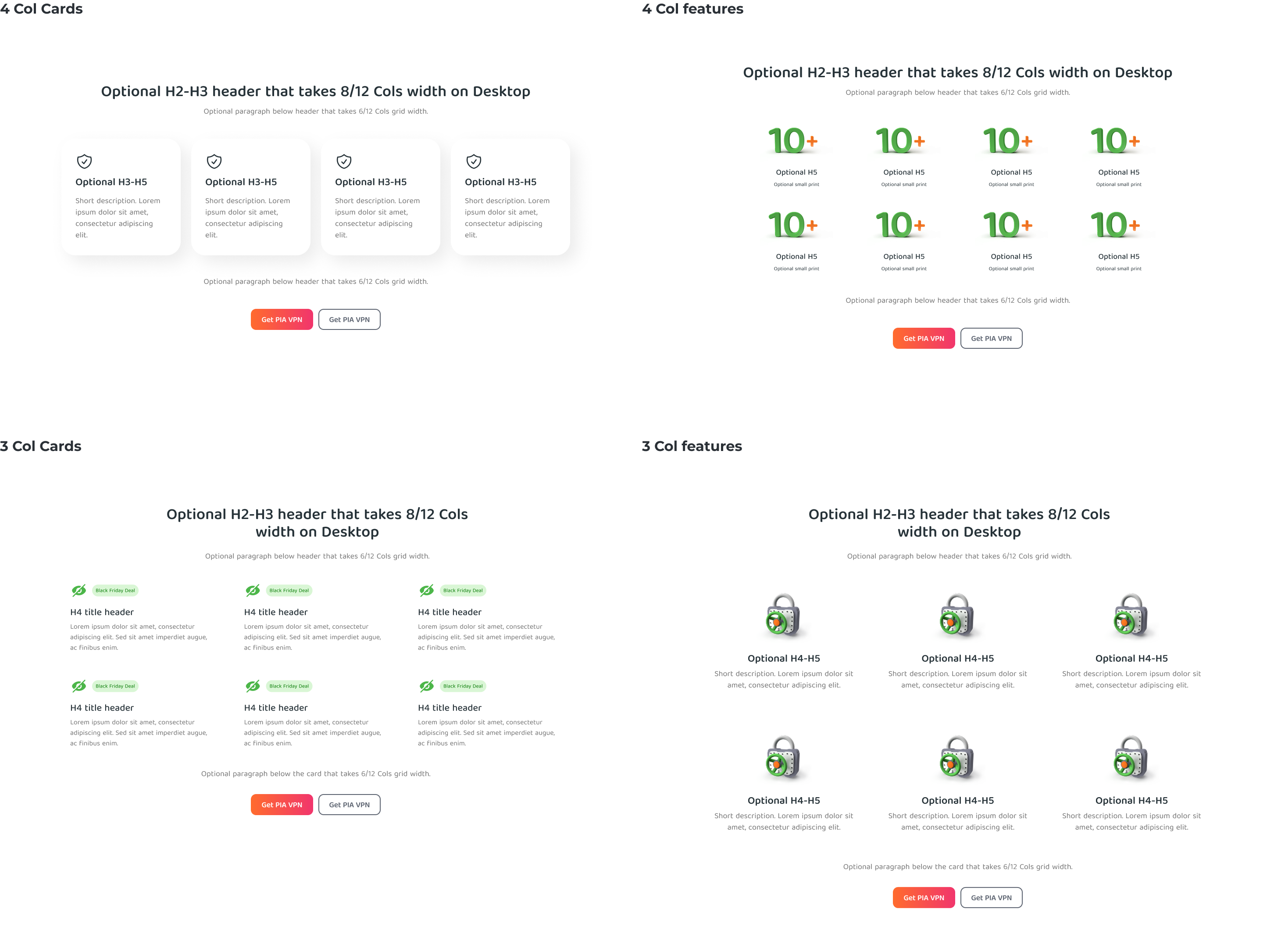
06 — the Solution
Turning recurring patterns into reusable building blocks
Rather than redesigning the website from scratch, we used the audit findings to identify the patterns that appeared most often across the site.
We standardized those patterns into a shared system that could support both everyday design work and future CRO experiments.
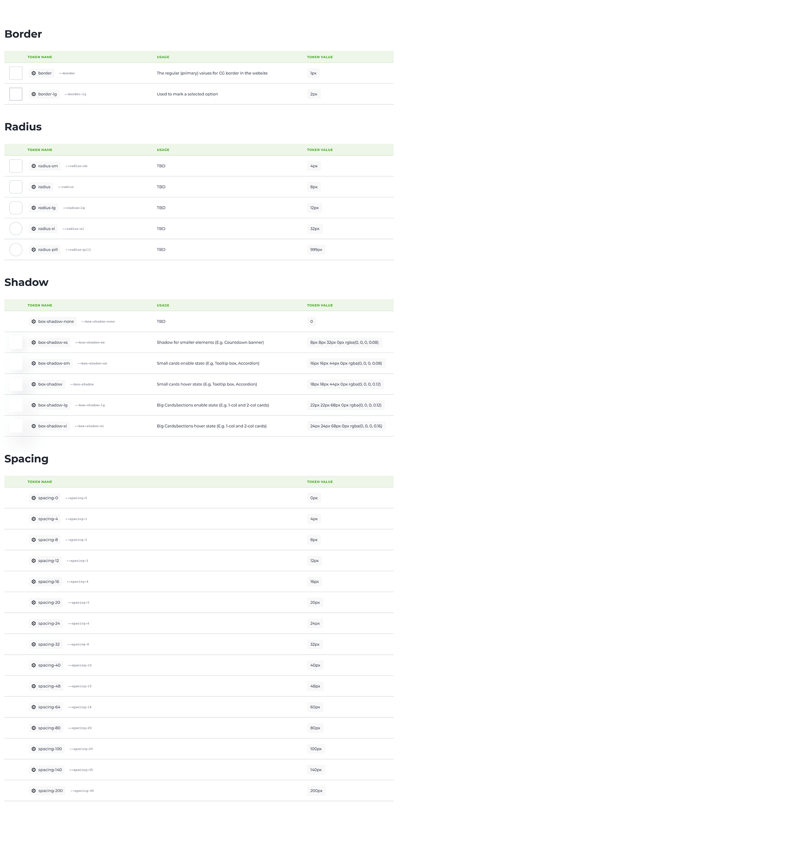
Tokens
Colors, type, spacing

Components
Buttons, cards, tables
Content Blocks
Heroes, features, CTAs
Pages
Assembled from blocks
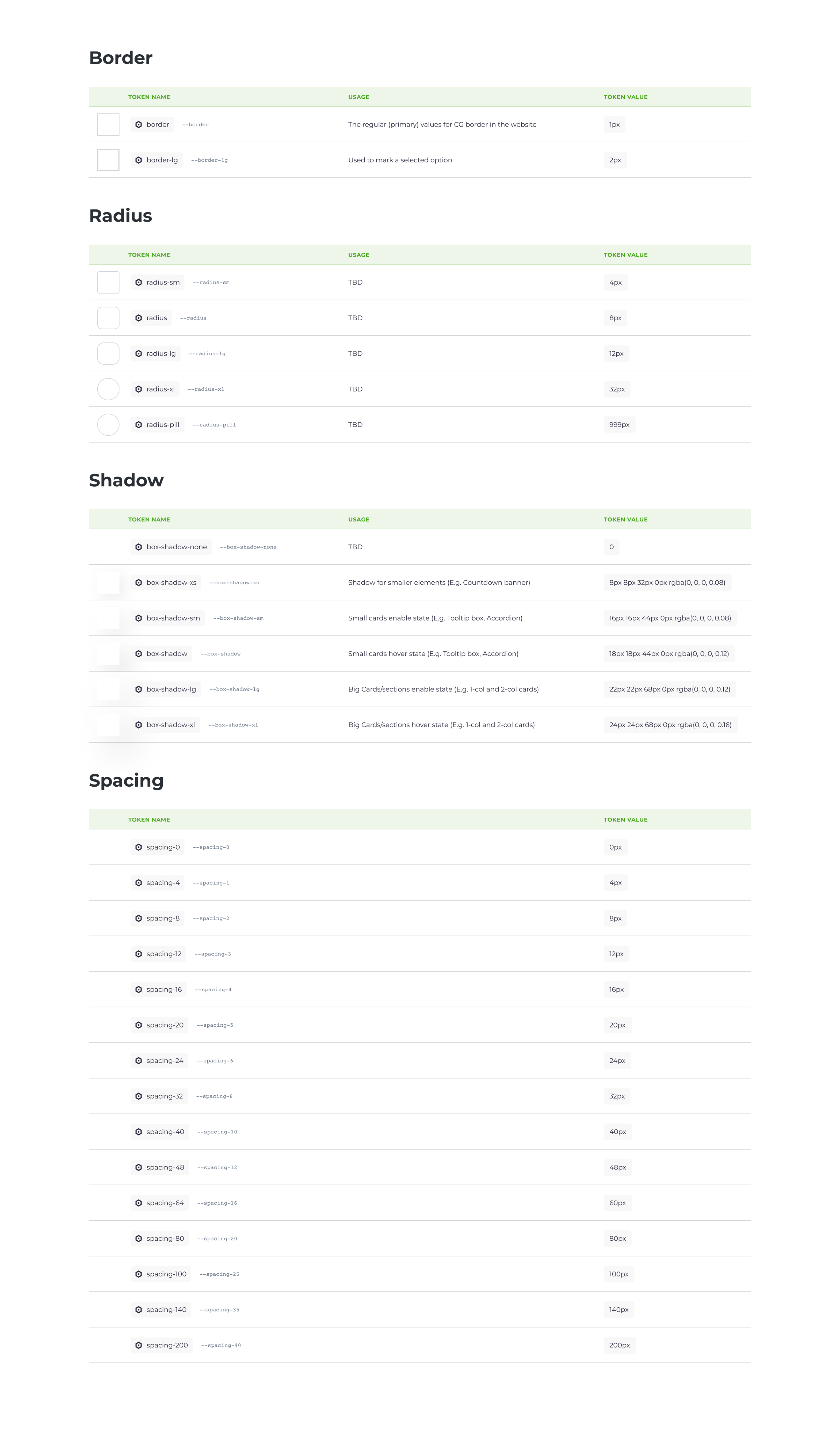
Layer 01
Foundations
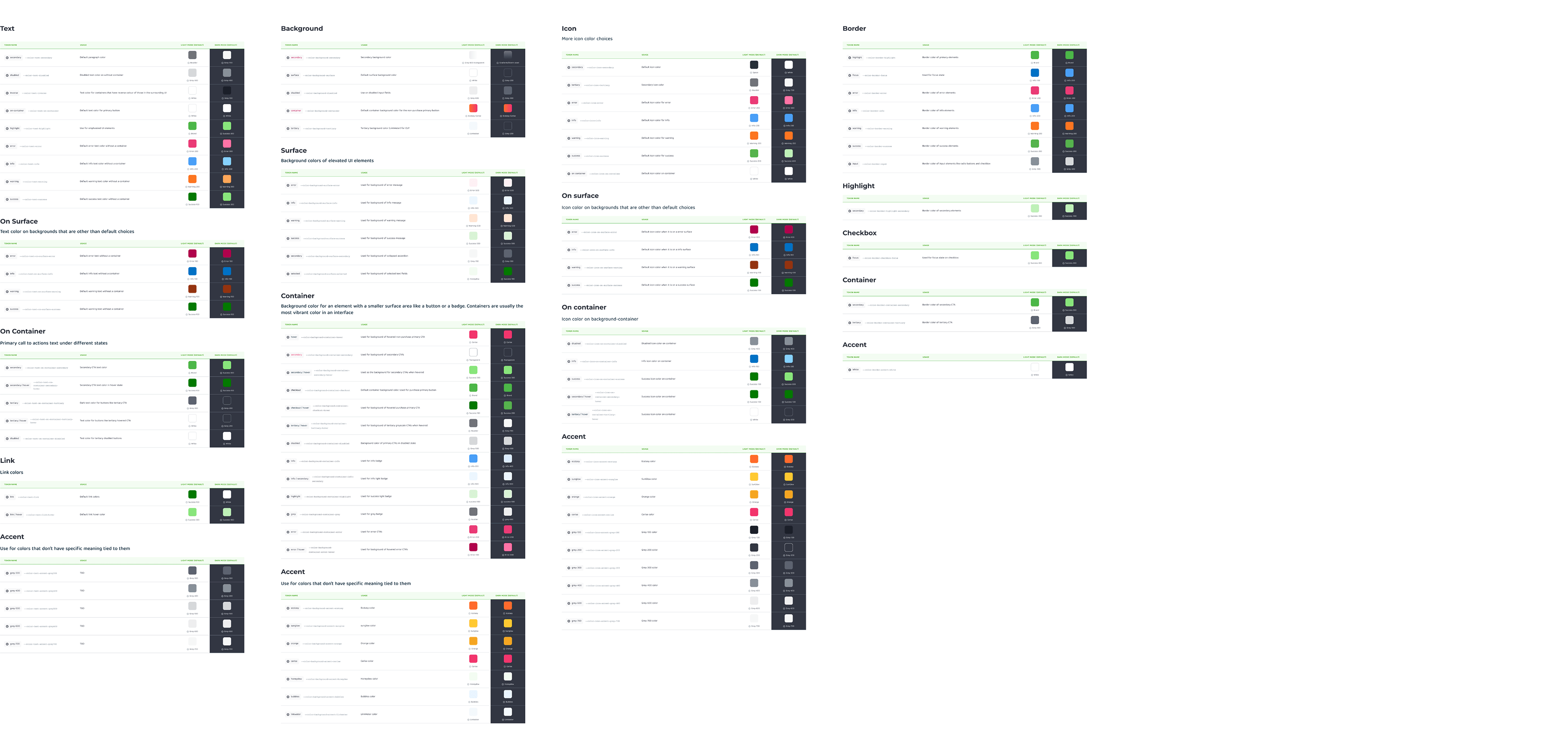
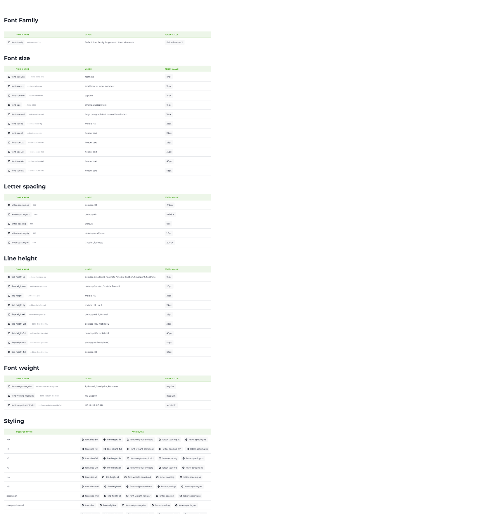
The basic decisions shared across every page. These became the foundation that everything else referenced.
Colors
Typography
Spacing
Border Radius
Grid System
Shadows
Color Tokens — Text, Background, Icon, Border
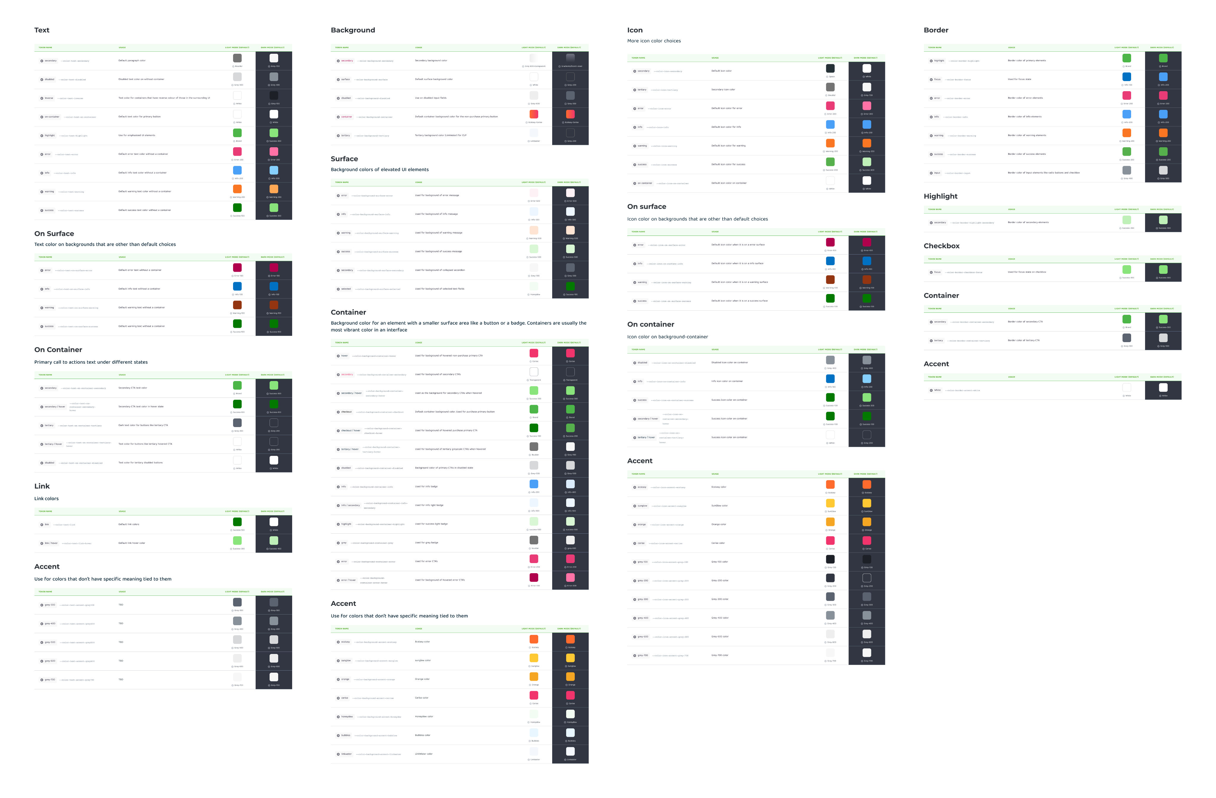
Typography Tokens
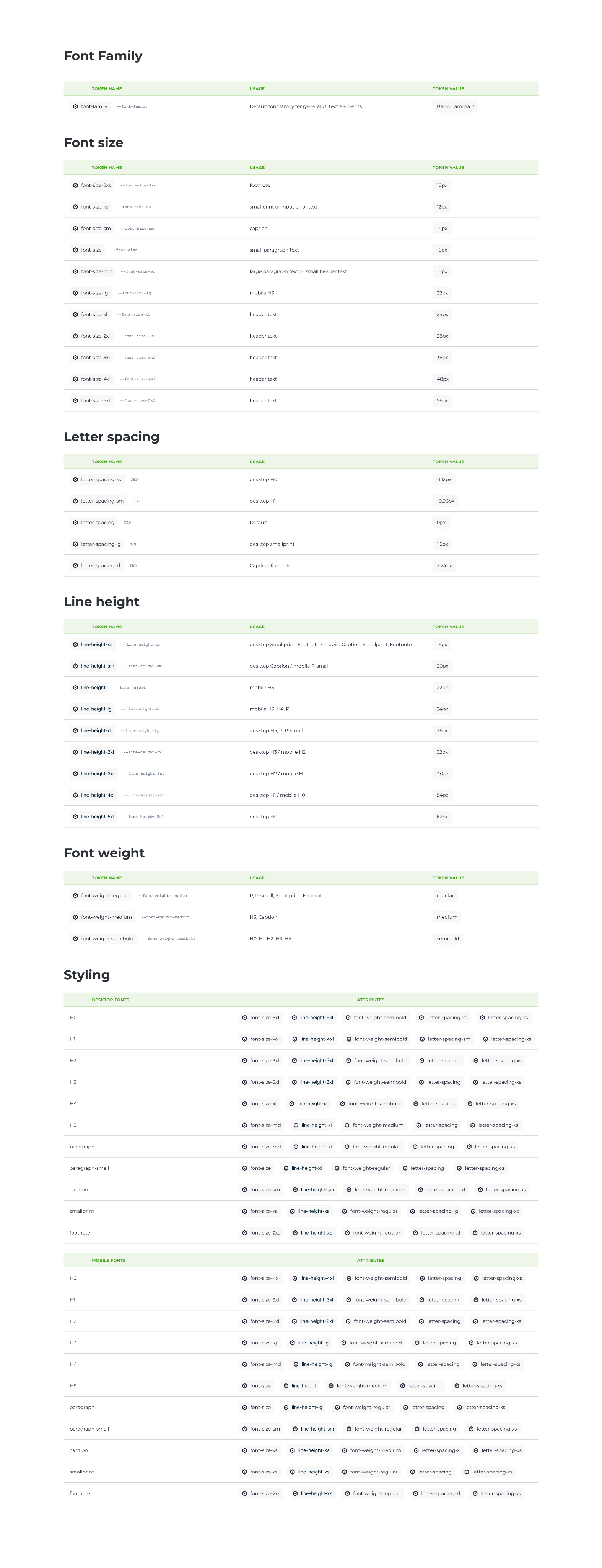
Spatial Tokens & Responsive Grids
Layer 02
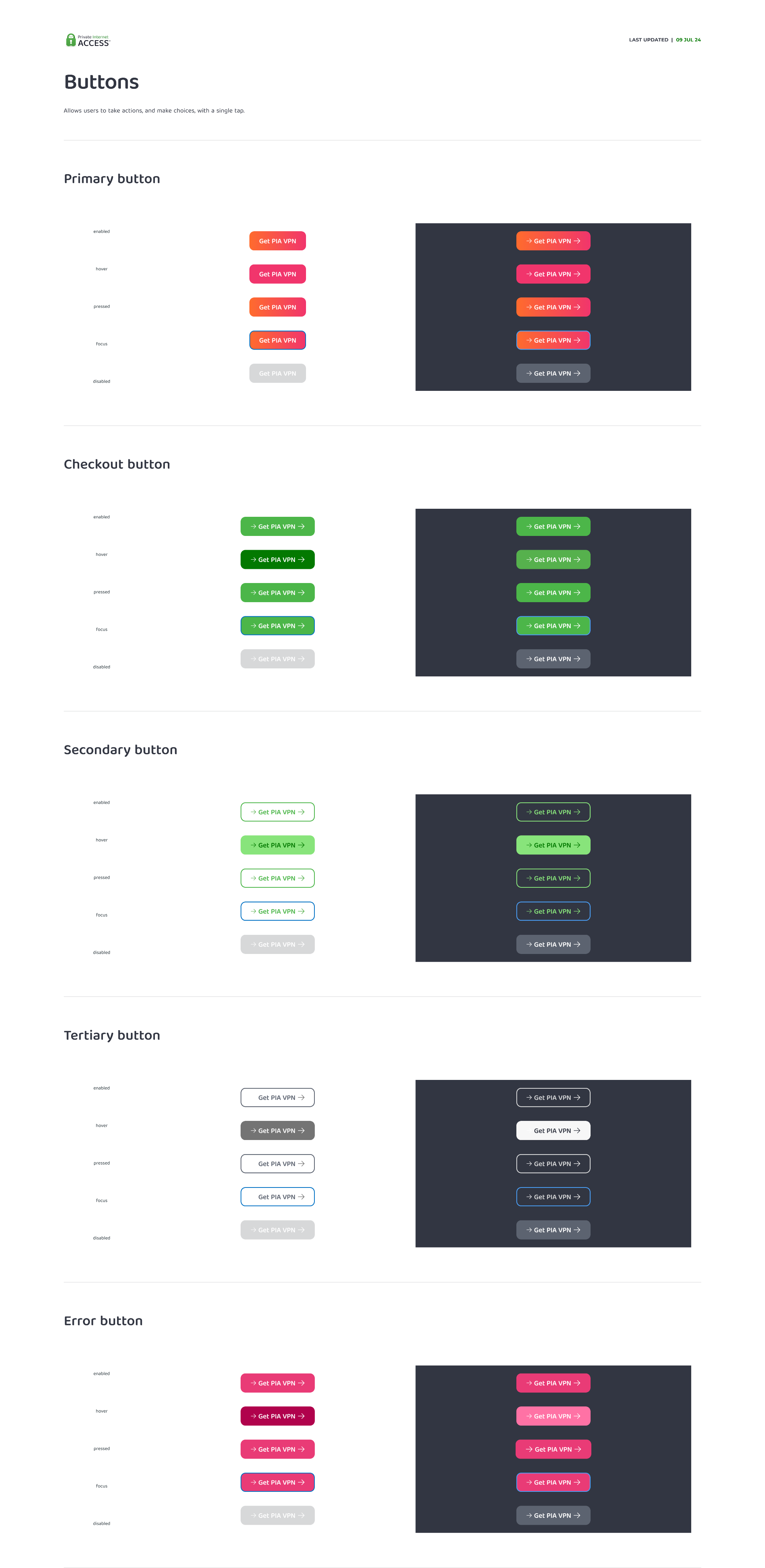
Components
Reusable UI elements that replaced dozens of existing variations. Each component was created to replace patterns identified during the audit.
Buttons
Cards
Tables
Navigation
Form Elements
Badges
Icons
Button component from the design system
Layer 03
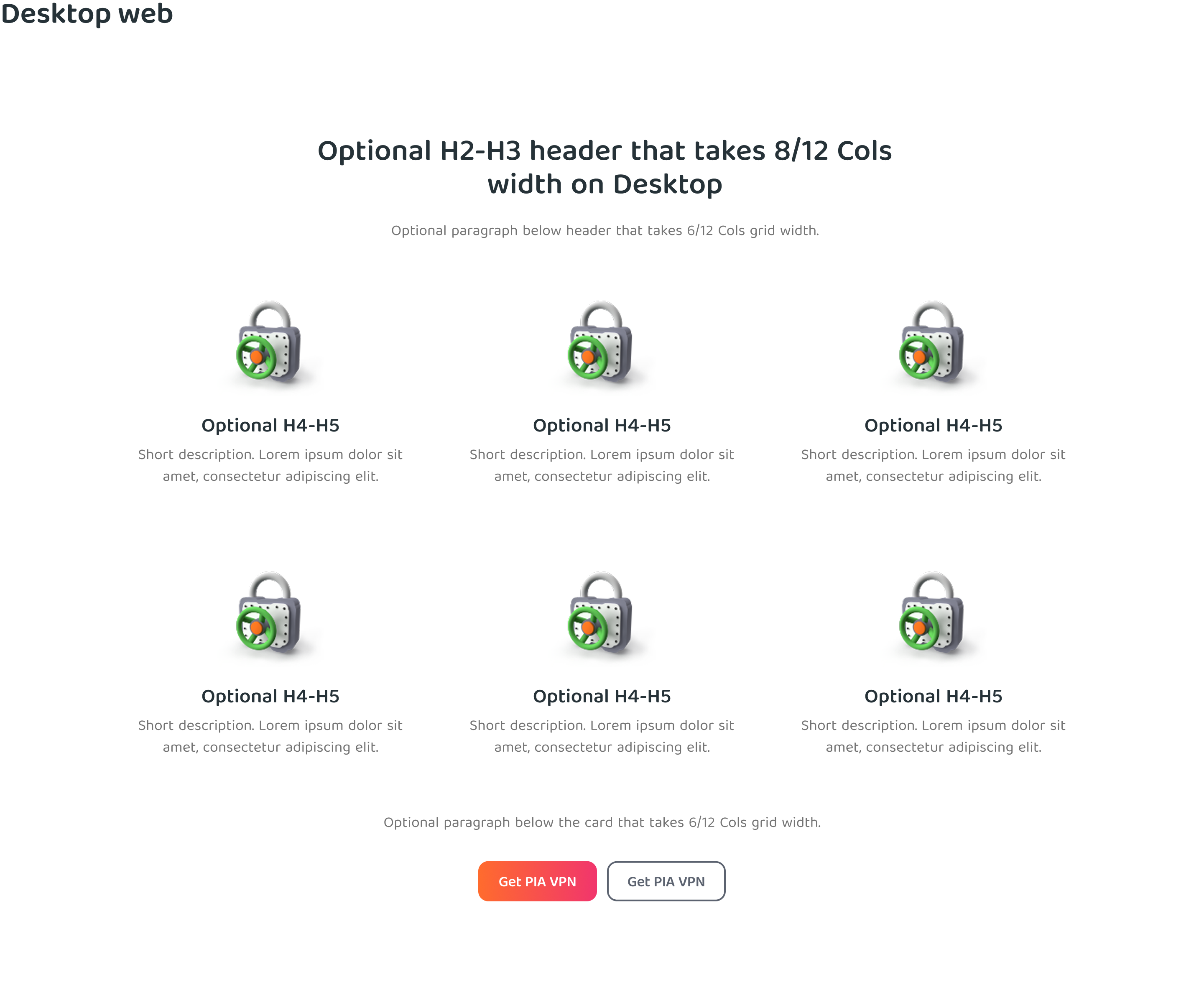
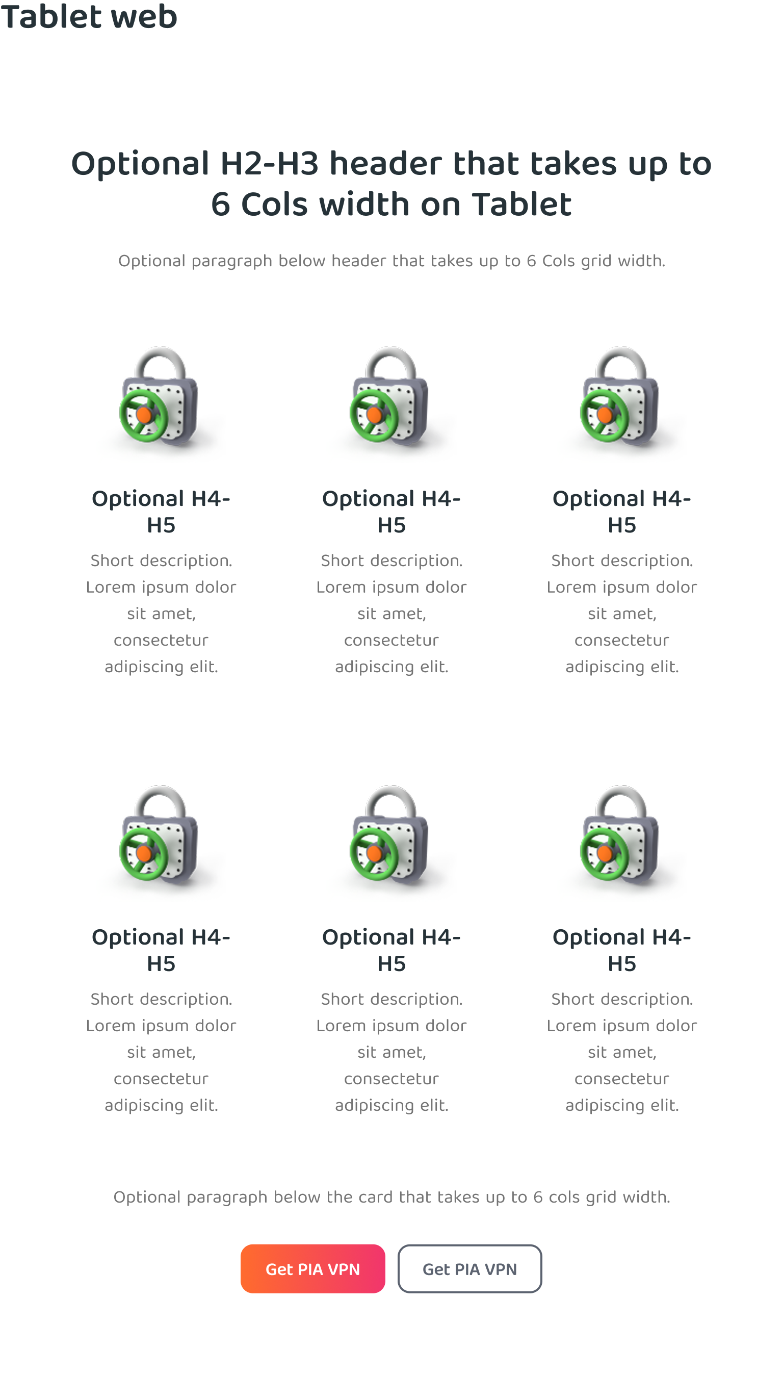
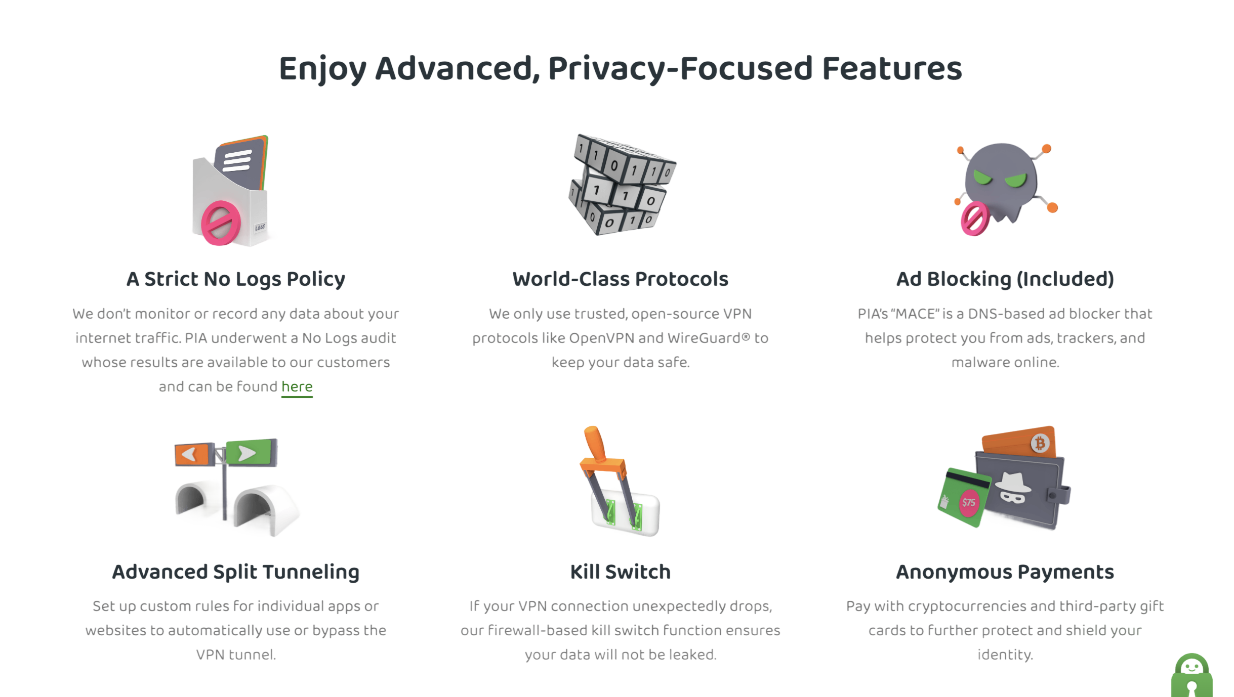
Content Blocks
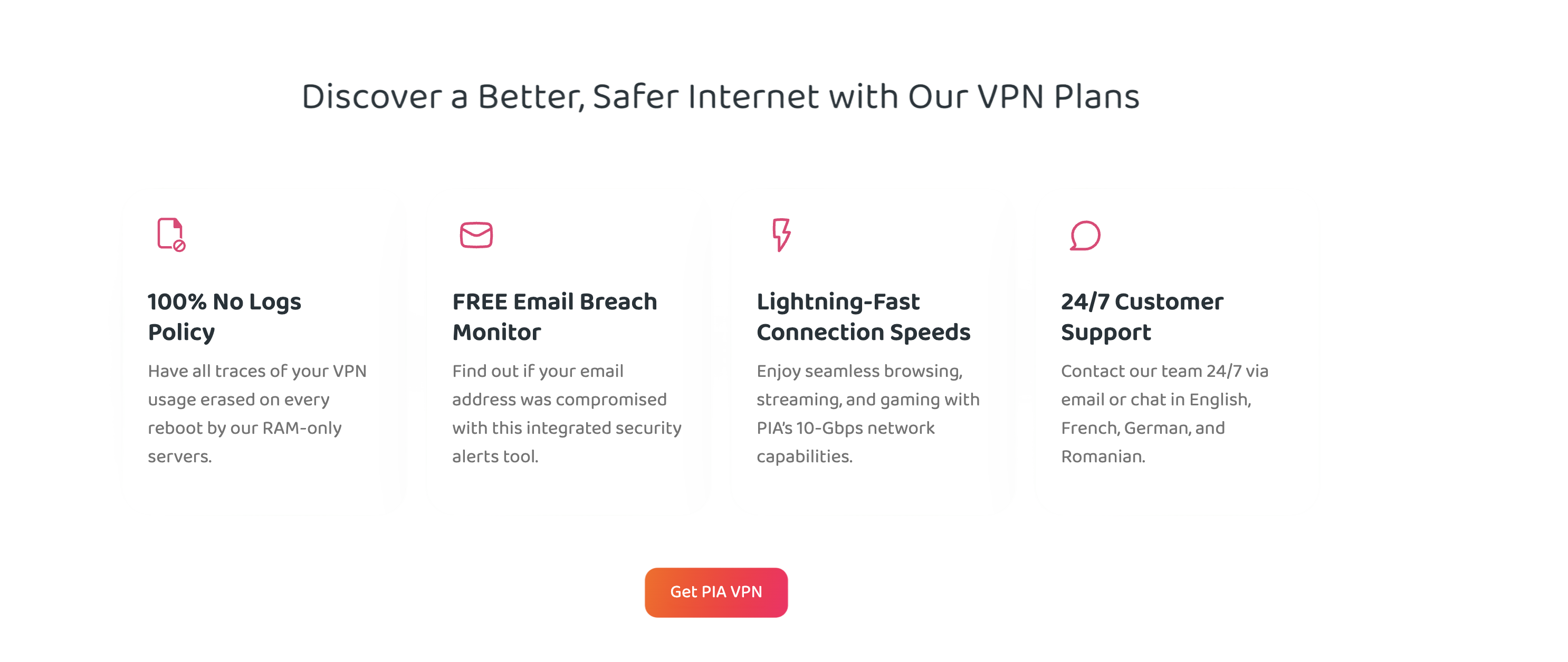
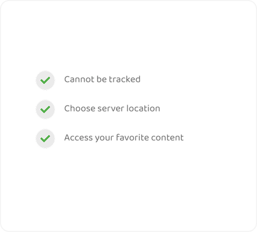
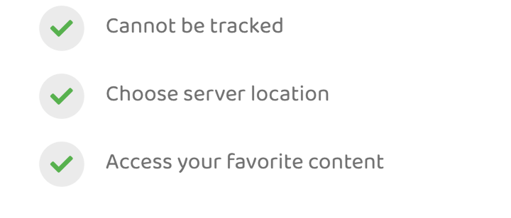
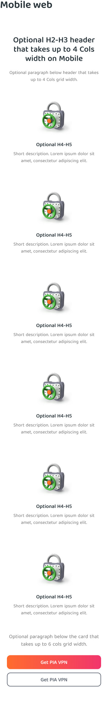
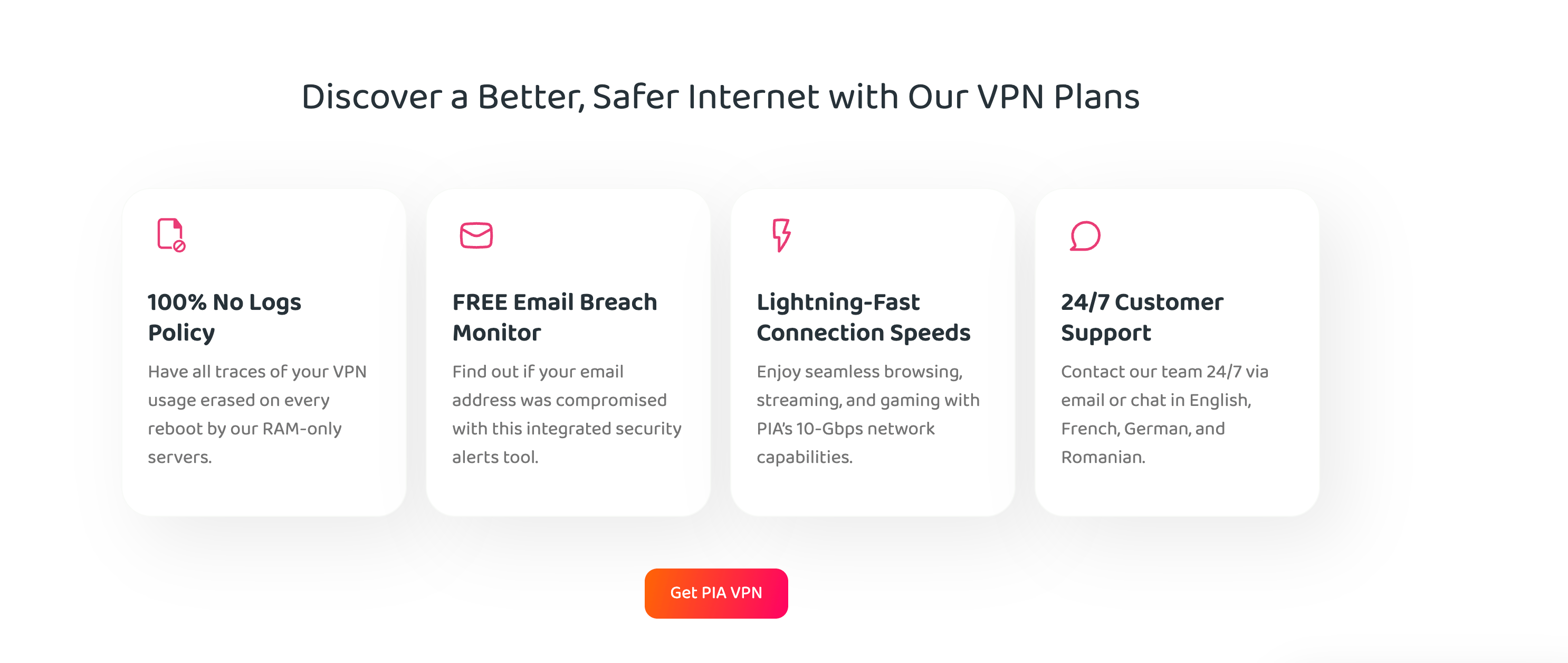
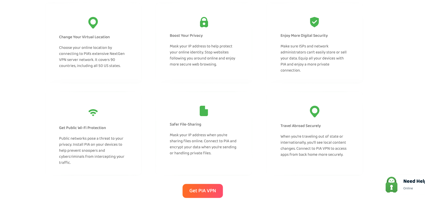
Reusable page sections designed specifically for marketing pages. Instead of rebuilding sections from scratch, designers could assemble pages using tested, consistent blocks.
Hero Sections
Feature Sections
Comparison Tables
Pricing Modules
FAQ Sections
CTA Blocks
Content Blocks — 3 Col Features, responsive
Layer 04
Pages
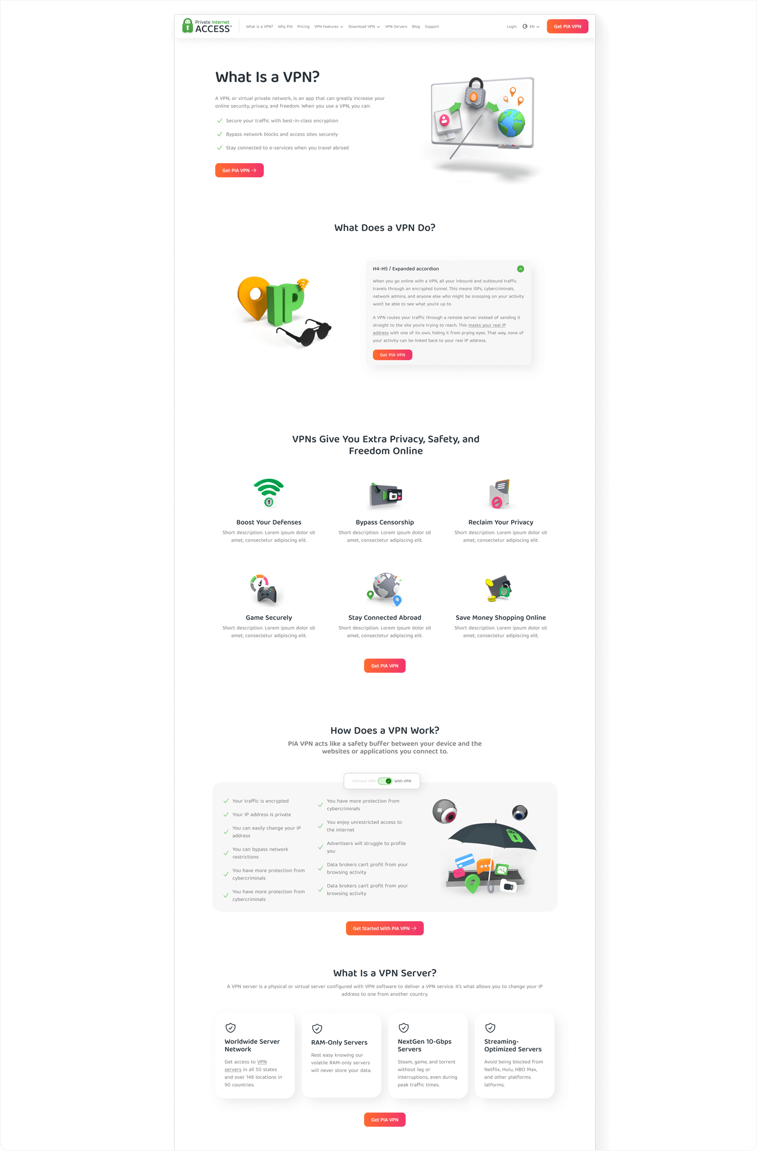
Complete page templates assembled from the layers below. Instead of designing each page from scratch, we combined content blocks and components into ready-to-use templates for every page type on the site.
Homepage
Product Pages
Landing Pages
Pricing Page
Support Pages
Page Template — Example page assembled from the design system
07 — Before & After
From dozens of variations to one flexible system
The goal wasn’t to make every page look identical. It was to reduce unnecessary variations and create a shared set of patterns the team could rely on.
Before — Feature Cards

After — One flexible component
07 — Impact
More than a visual cleanup
Unlike the previous attempt, people actually use this system. A new designer joins, opens the file, and starts working.
Design decisions no longer live in old files or in someone’s memory. The system became the shared starting point for new pages, experiments, and campaigns.
For Users
The site feels more consistent from page to page, making it easier to navigate and understand what to expect.
For Designers
Less time searching through old files and rebuilding existing patterns. More time focused on solving design problems.
For New Team Members
A clear place to start instead of dozens of files, making onboarding faster and reducing guesswork along the way.
For The Business
New pages and campaigns can build on existing patterns instead of creating more inconsistencies across the website.
Next Case Study