Intego
2025
A Complete Redesign of the Antivirus Account
Redesigning a security account around clearer protection, scalable product growth, and relevant upgrade opportunities.
Overview
Growth needed a clearer foundation
As Intego moved from separate security products toward the unified IntegoONE experience, the Account needed to become more than a place for managing subscriptions. It had to connect products, introduce new security features, and create relevant opportunities for upgrades.
But adding more to an already unclear page risked increasing complexity. Before designing for growth, I needed to understand what we already knew about Intego’s customers, what the existing Account communicated, and where we were still making assumptions.
Problem
The interface was unclear. The user need was still unknown.
Before adding new products, features, or upgrade opportunities, I audited the existing Account. Three problems stood out.
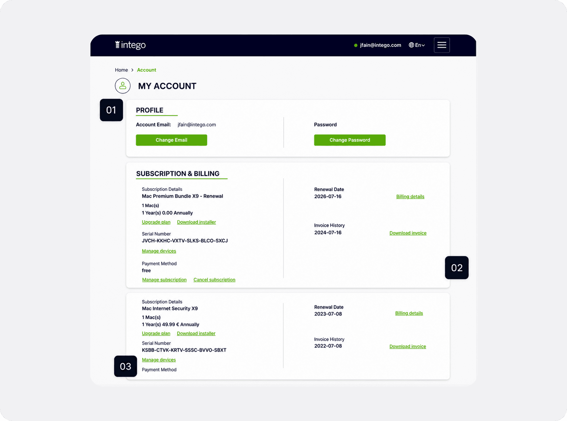
01 Least used content came first · 02 Different states looked identical · 03 Details and actions competed for attention
Adding more features on top of this structure would only increase complexity. The audit revealed issues in hierarchy, state differentiation, and competing information, but it could not tell us how customers actually used the Account.
With no Account-specific user research available, the next step was to combine these observations with the evidence we already had and define a direction we could later validate.
Research
Building on the evidence we already had
To understand what mattered most, I revisited an existing persona study based on customer interviews, a validation survey, and internal data. I also compared the Account with Intego’s desktop app and three leading security products.
Each source answered a different part of the question.

The Account needed a clearer hierarchy between reassurance, management, and commercial content.
The persona research showed different levels of involvement with security, while the product and competitor reviews suggested an opportunity to make protection status clearer and easier to scan.
This led to a working hypothesis: prioritising protection and coverage could create a clearer foundation for both account management and relevant upgrade opportunities.
Design approach
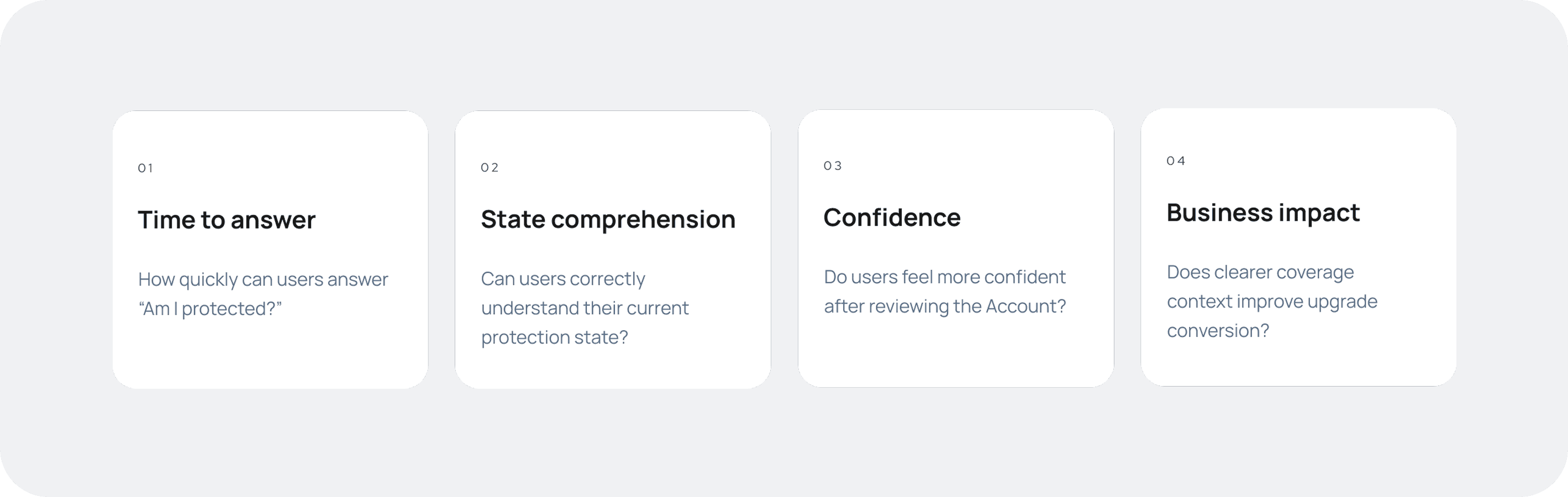
One question became the filter
The research gave us a way to evaluate every design direction:

Designs
Designing reassurance into the Account
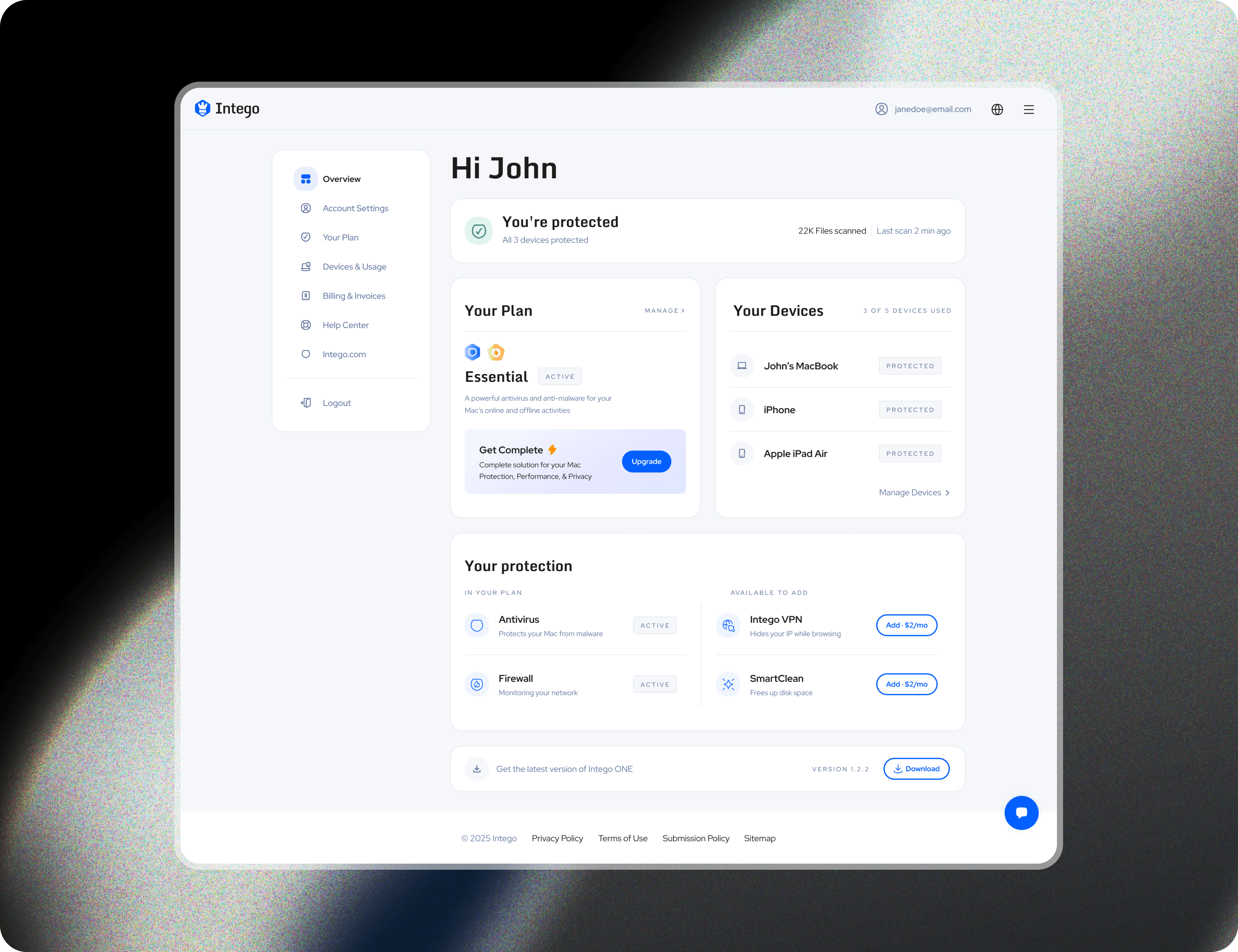
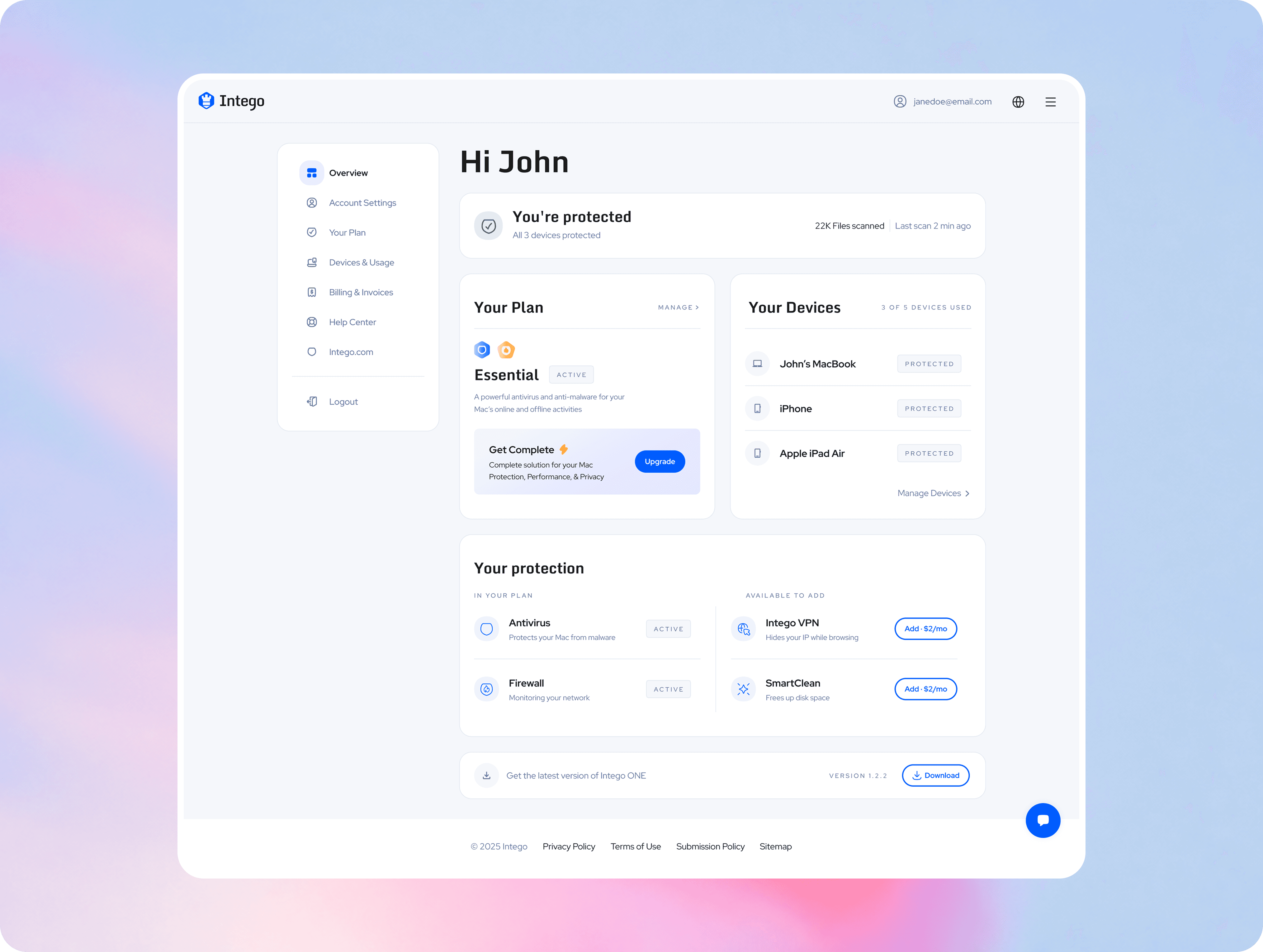
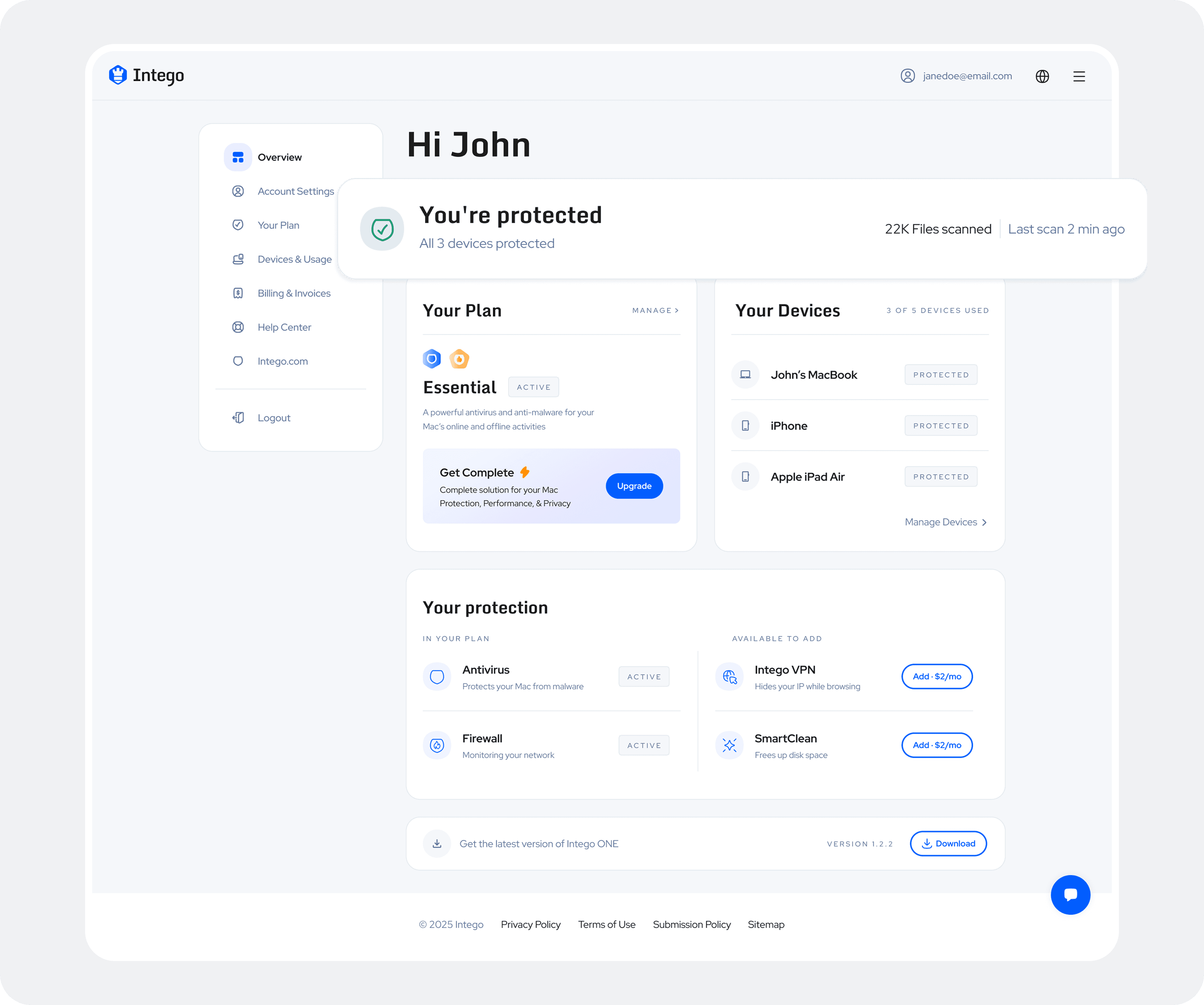
The final design turns the Account into a clear overview of the user’s protection. Status leads the experience, supporting information explains the scope of coverage, and deeper controls remain accessible without competing for attention.
01 — Answer first. Prove it immediately.
The Account begins with a direct answer: “You’re protected.” Device coverage defines the scope, while the last scan and files scanned show that protection is active now—not simply paid for.
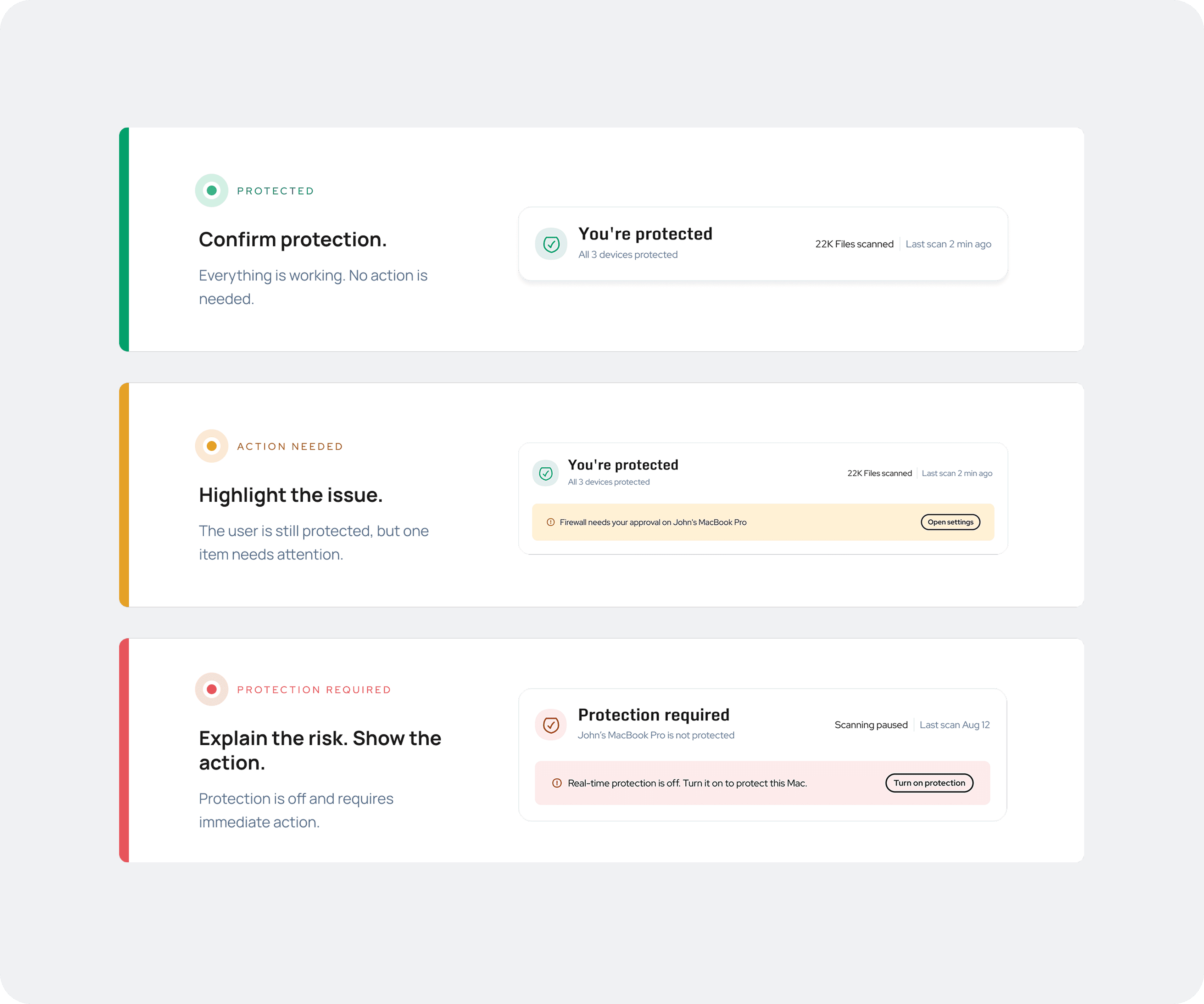
02 — Urgency changes. The structure doesn’t.
Protected, action needed, and protection required use one system. Color, icon, message, and action change together, allowing users to understand urgency without relearning the component.
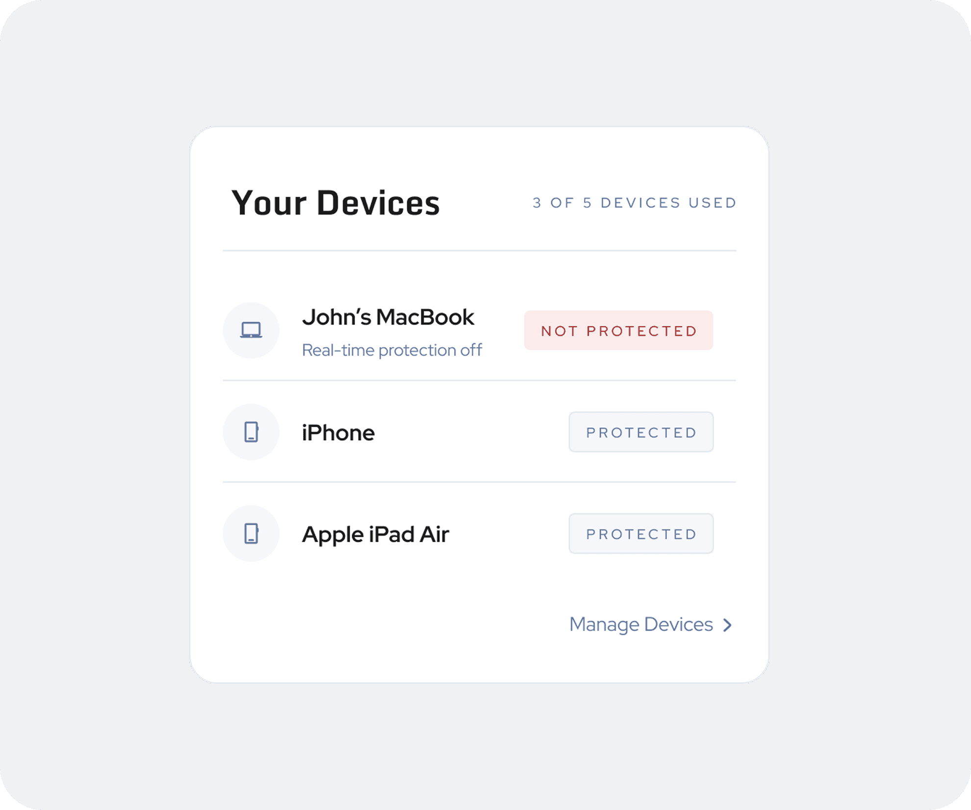
03 — One weak device can change the whole answer
An account-level status should never hide a device-level issue. Healthy devices stay quiet, while exceptions explain what changed and where action is needed.
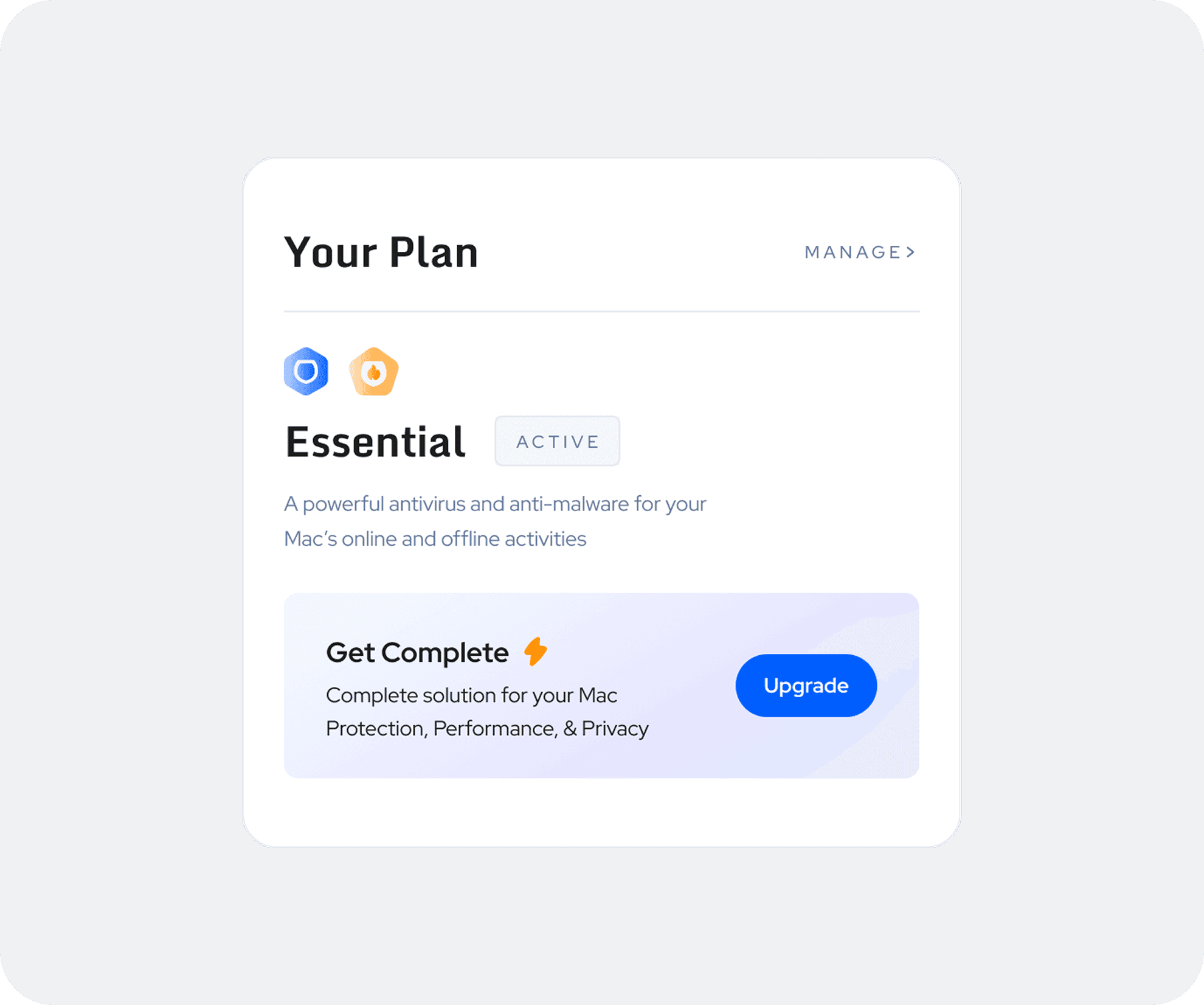
04 — An overview isn’t a management page
The home page shows the plan, its current state, and a clear route to management. Detailed controls remain secondary, so administrative tasks do not compete with reassurance.
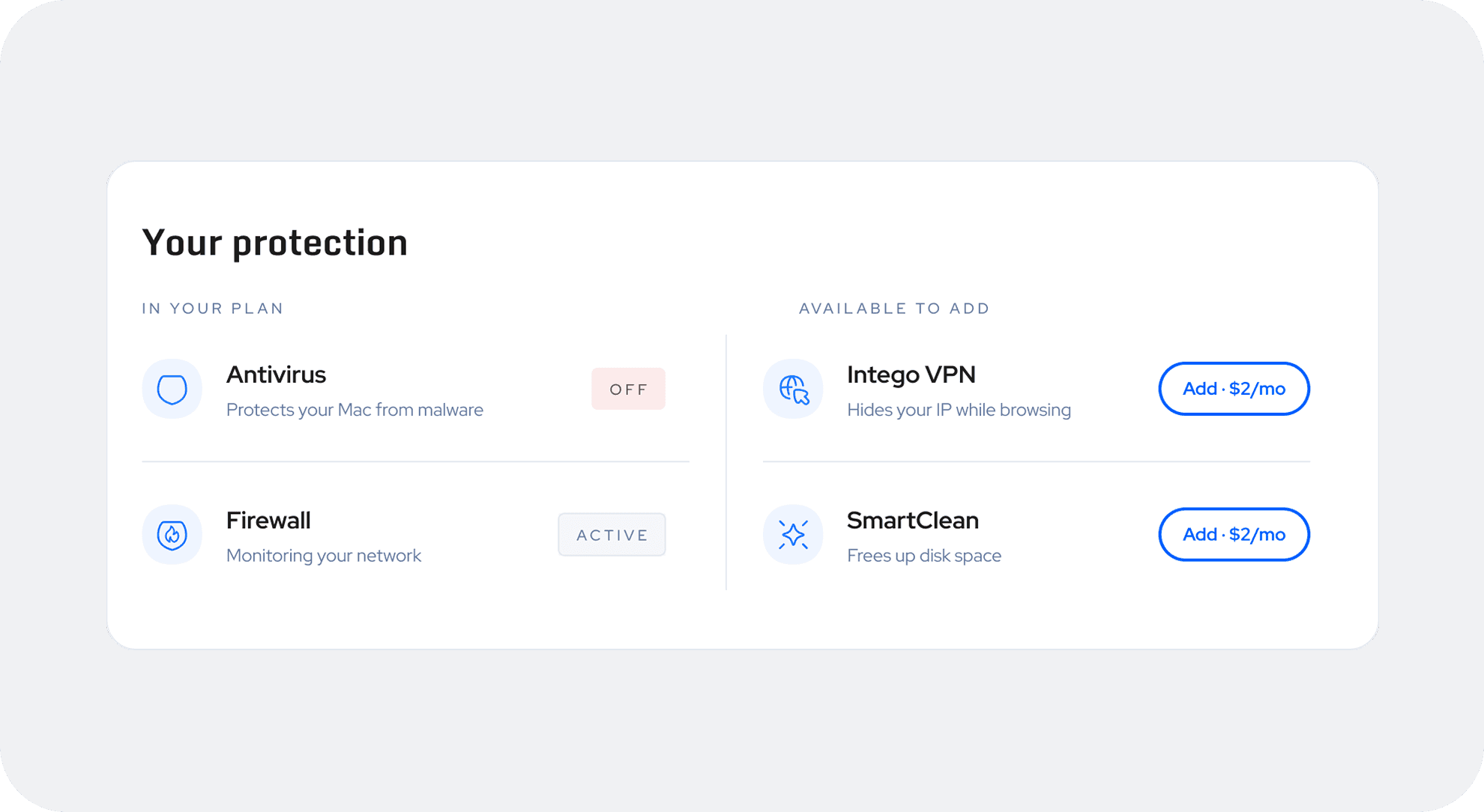
05 — Context before conversion
The decision was not whether upgrade opportunities should appear—it was when they should appear and what users needed to understand first.
Existing coverage and available add-ons are clearly separated. Users see what they already have before relevant products such as VPN or SmartClean are introduced.
Nothing important was removed. The page simply answers the user’s question before asking for their attention.
Next phase
The design was approved. The questions were not finished.
By the time I left the company, the design had been approved and development of the first version was underway.
The next step was to validate the redesign against the user and business goals defined during the project.