CyberGhost VPN
2022–2023
Pricing & Checkout A/B Tests
Three CRO experiments that tested changes to CyberGhost’s pricing and checkout experience—and what we learned from each outcome.

Overview
What can a win, a loss and an inconclusive test teach us?
At CyberGhost, we continuously tested changes to the pricing and checkout experience. Each experiment followed the same process: we identified a question using behavioural and performance data, designed a variation, split traffic between the existing experience and the new version, and reviewed the results before deciding what to do next.
My role was to analyse user feedback, help turn recurring patterns into testable hypotheses, and design the variations with the design team.

The process
How do you know if a design change actually works?
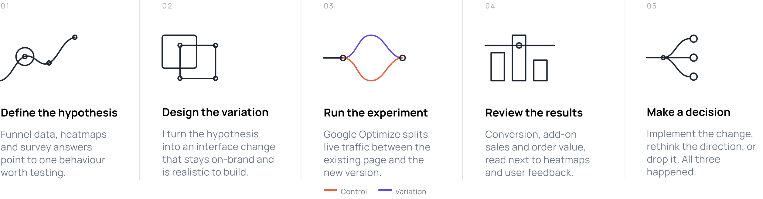
Every test ran through the same five stages. Traffic only splits in one of them — everything before it is preparation, and everything after it is interpretation.
Tools we used:

Selected experiments
A win, a loss and one result that remained unclear
The same process led to three different outcomes. Each one is shown the same way: what we wanted to learn, what changed on screen, what the data said, and what we took into the next test.
A sticky CTA that boosted add-on sales

On the checkout page, the pay button sat directly under the plan cards. Heatmaps showed people scrolling past it to read the add-on offers — and then having nothing left to click. We pinned the button to the bottom of the screen with the selected plan named beside it, and changed nothing else on the page.

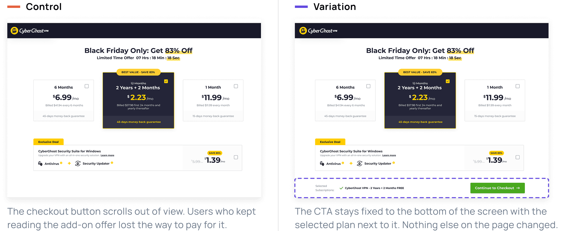
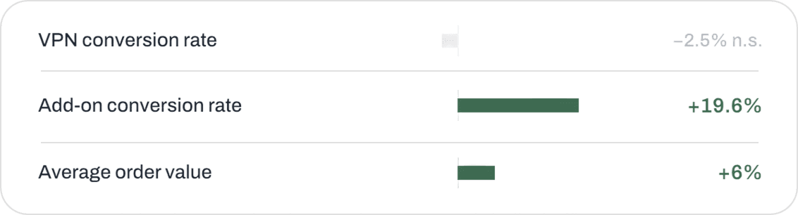
The main conversion rate didn't move. Add-on sales rose 19.6%.
What happened
The VPN conversion rate stayed flat. Add-ons did not: out of roughly 60,000 visitors per group, 334 users in the variation bought an add-on against 305 in the control — 0.55% against 0.51%.
Across the two-week run the variation stayed ahead on most days, so the lift was steady rather than a single spike.
What we learned
Keeping the action visible made people comfortable enough to add to their order instead of rushing to finish it. The headline conversion rate is not always the metric carrying the business result — this one moved revenue without touching it.
The sticky bar was rolled out across the checkout flow.
Do extra benefits really drive more sales?

In exit surveys, 11.6% of the users who left the pricing page said they weren't sure what they were actually buying. We added a benefits section — what the subscription covers, which devices it runs on, product screenshots and a short video — and placed it below the plan cards. The plans themselves stayed exactly as they were.

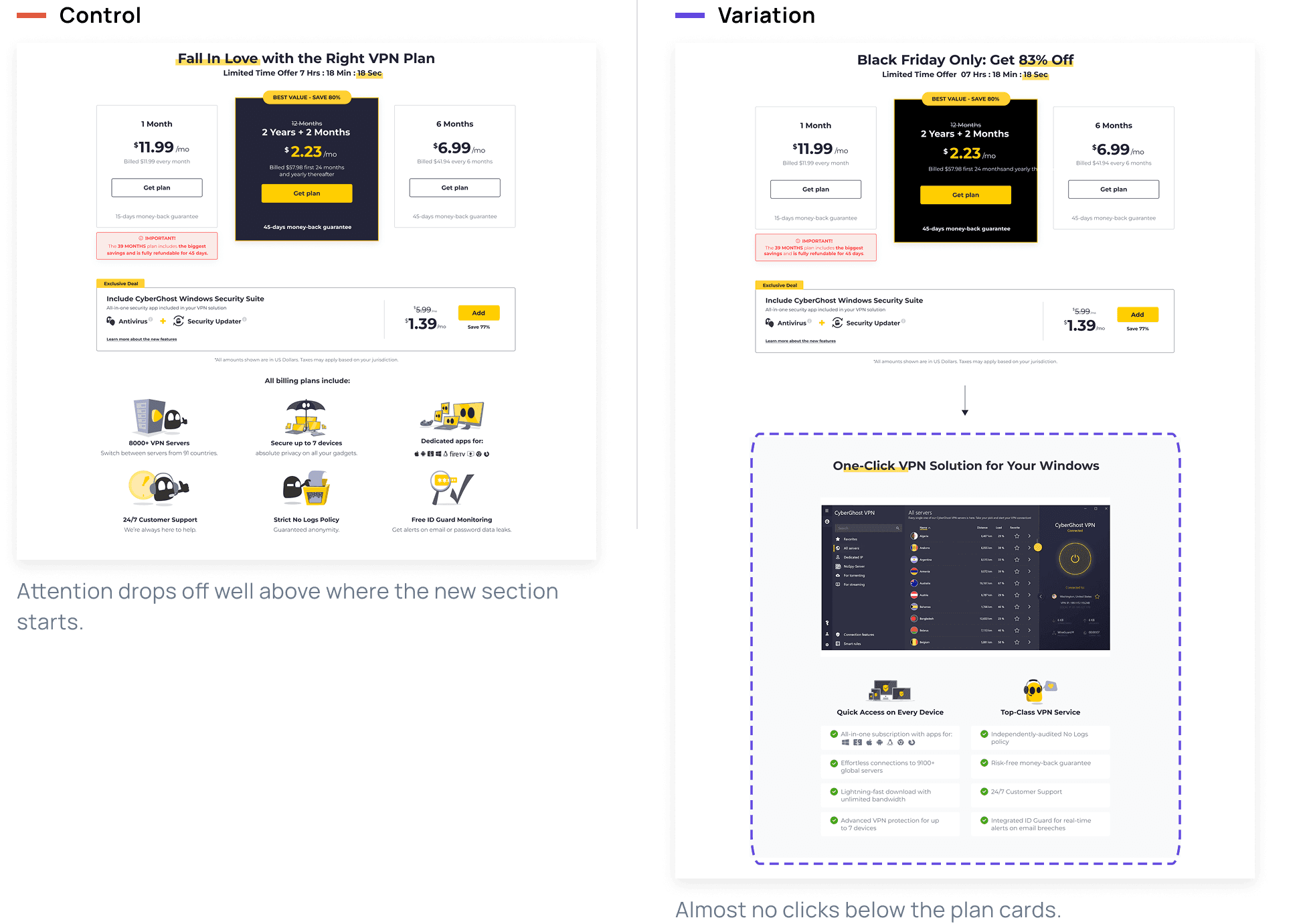
We couldn't answer the question, because most users never saw the change.
What happened
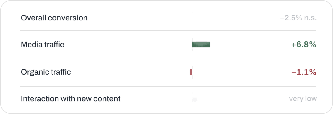
Overall conversion moved 2.5% down, which was not statistically significant. One segment — media traffic — showed a small lift.
The heatmaps explained the flat result better than the numbers did: most users stopped scrolling before the new section began, and the few who reached it barely interacted with it.
What we learned
The test measured placement, not persuasion. Users decide near the top of the page, so reassurance has to sit beside the plans rather than underneath them — more content further down doesn't get read at all.
What happened when we broke the pricing rules

The pricing page showed three plans side by side, with the two-year Hero plan in the centre and visually highlighted. Attention research says the middle of a row is read first, so we tested a different sequence — the Hero plan moved out of the centre spotlight. Prices, copy and layout were identical in both versions; only position changed.

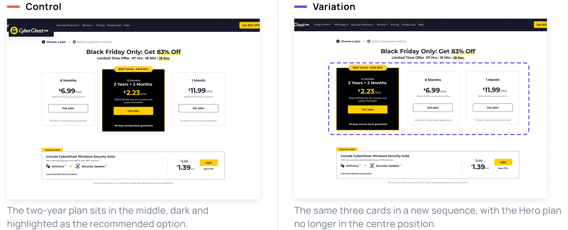
More people converted — and the business earned less.
What happened
At first the variation looked like a winner: 8.8% of that group converted against 7.01% in the control.
Segmenting by plan reversed the reading. The extra conversions were all on short, cheap subscriptions, while selection of the two-year plan fell by about a fifth. Overall conversion ended 17.5% down, and revenue with it.

What we learned
Position carries meaning. Users expect the best offer in a familiar place, and moving it made a cheaper plan look like the default choice.
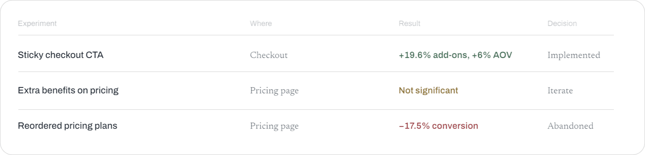
Three tests, three outcomes — and each one changed how we designed the next.