PIA VPN
2024
Building a Scalable Design System
I led the design of a shared system for PIA’s marketing website—turning recurring decisions into reusable rules the team could use and improve through real projects.
Overview
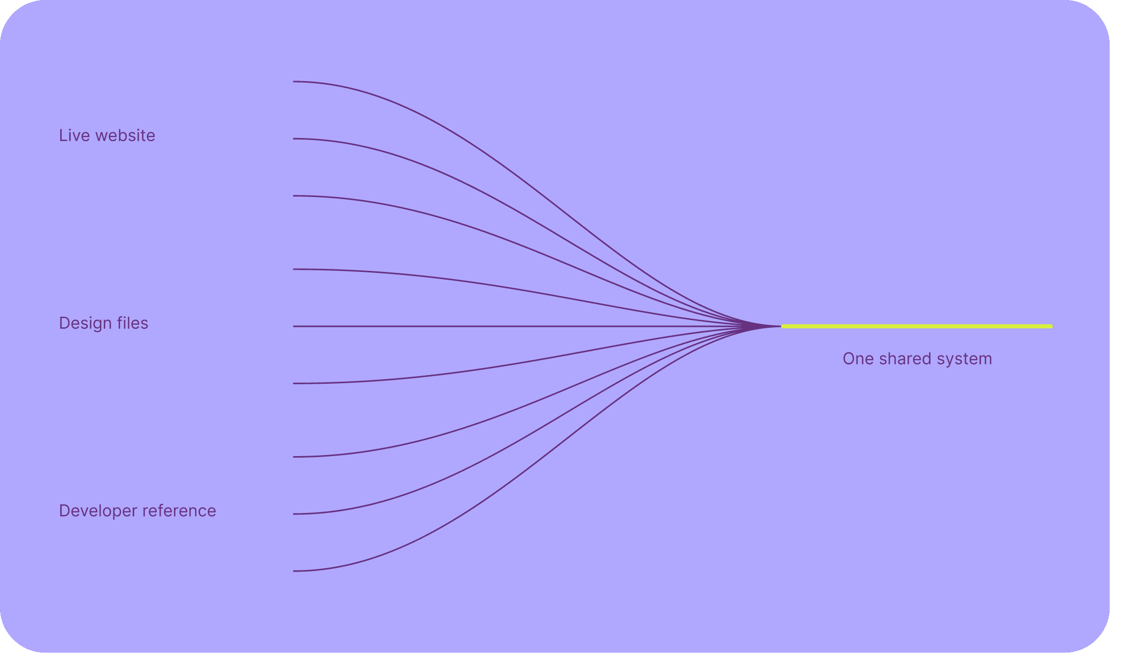
We turned three sources of truth into one shared system
PIA’s marketing teams worked across landing pages, pricing, checkout, comparison pages, and CRO experiments. The latest answer could live in a design file, on a live page, or only in the developer implementation. Before starting a new brief, designers first had to find the most reliable version and work out which decisions were still valid. We brought the recurring answers together so the team could begin from the same foundations, components, and content patterns.
Problem
The same patterns looked and worked differently from page to page
Designers usually started by copying a page that looked close to the new brief. Because there was no shared library or clear place to find the latest version, each page kept its own choices. Buttons used different colours and sizes for the same kind of action. Cards in the same row used different amounts of text, image space, and alignment, which made them harder to compare.
Three-step sections changed their structure from page to page, even when they explained the same type of flow. None of these examples was a serious problem on its own. Together, they meant the team had to make, build, and check the same decisions again on every project.

Design approach
We kept what worked and removed unnecessary choices
We did not redesign the website from scratch. We reviewed what already worked across pages, kept the patterns teams already recognised, removed duplicate variations before introducing anything new, and changed only the parts that caused repeated problems.
These three rules kept the system focused and made it easier to adopt because it felt like an organised version of the existing product not a new visual language the team had to learn.

The system
The solution was more than a component library
A component library could give the team reusable UI, but it could not explain which option to choose, when to create a new one, or how repeated content should adapt across pages.
We therefore organised the solution into three connected layers: foundations defined the meaning of shared values, components carried behaviour and states, and blocks protected the structure of recurring content. The page remained free to tell a different story while the decisions underneath it stayed reliable.

Foundations
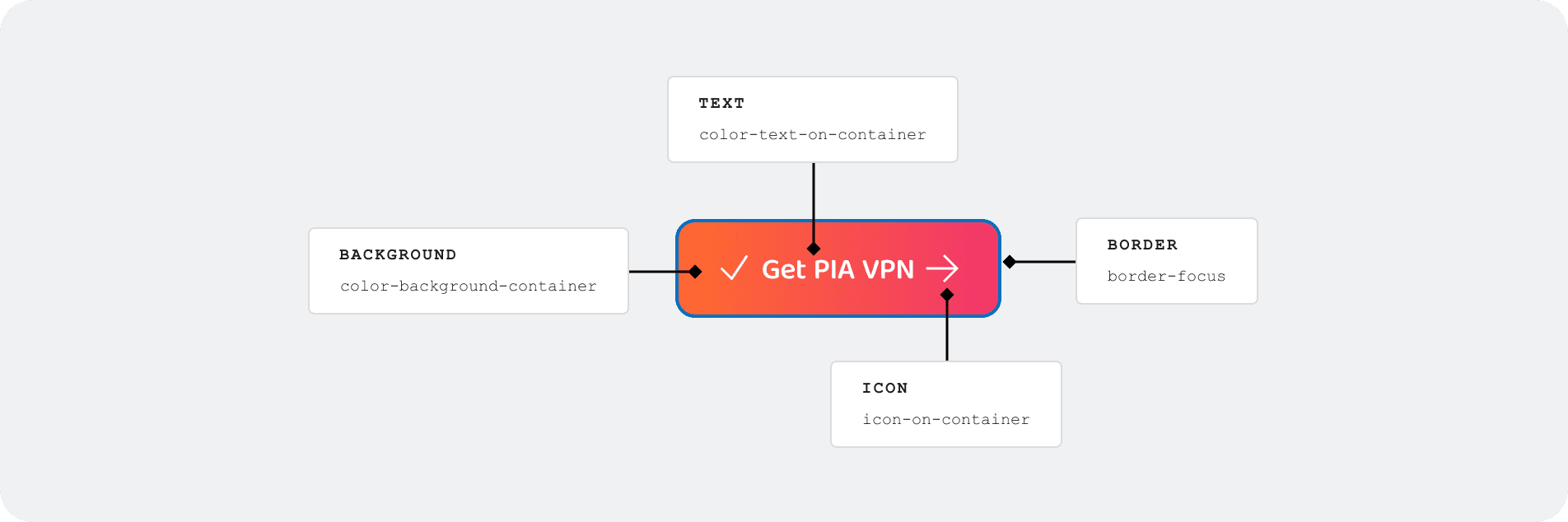
Foundations gave every shared value a clear purpose. Names such as
background.actiontold designers and developers what a value was for—not only what it looked like. A colour could change without changing its role, and every connected component could update from the same source.
Components
The modal shows how components carried shared structure and behaviour. Overlay, closing behaviour, spacing, text limits, motion, and responsive rules stayed consistent. Designers could change the size, alignment, imagery, timer, and actions without rebuilding the modal for every campaign.

Content blocks
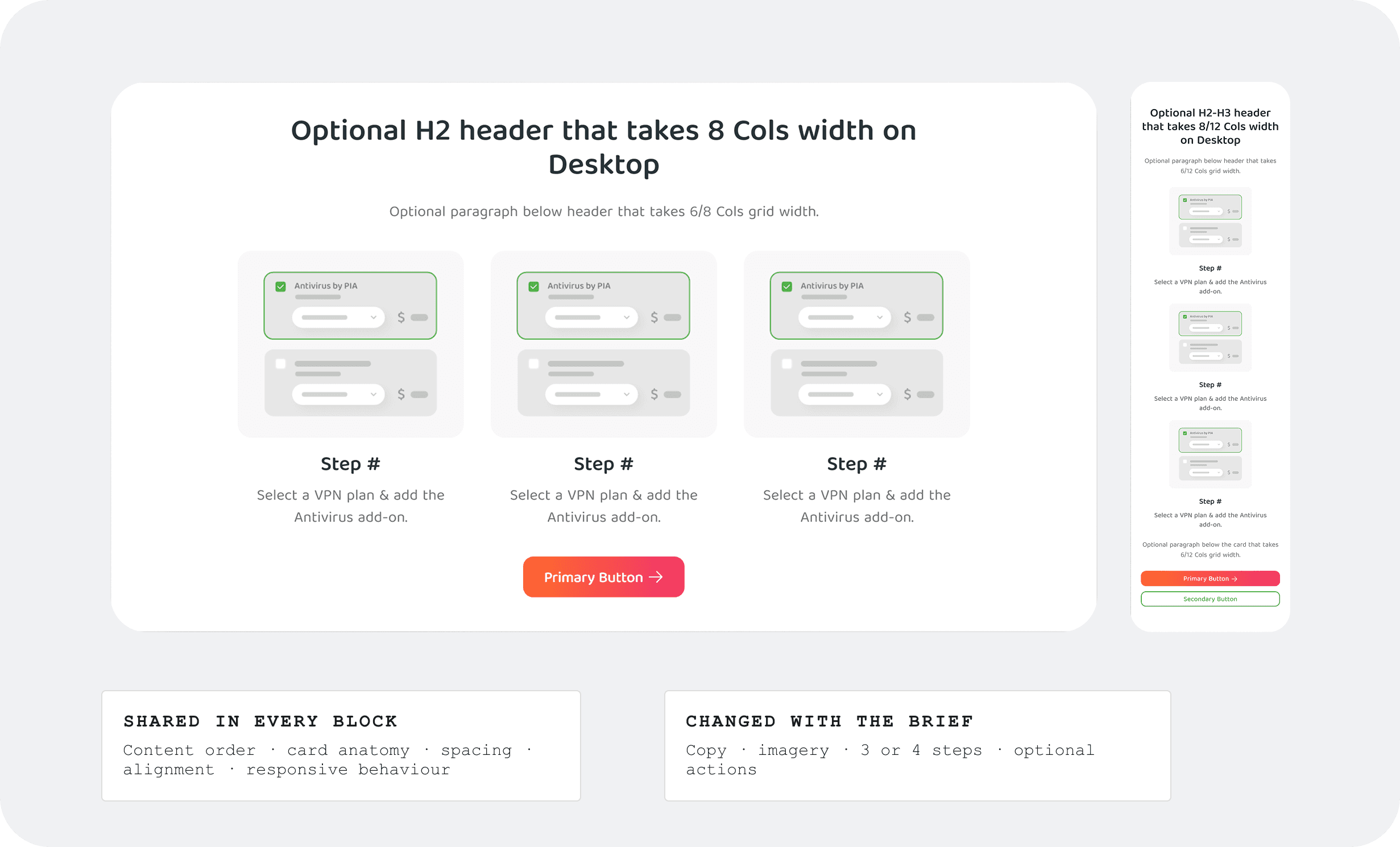
The Steps block kept one reading pattern across pages. Copy and illustrations could change, while the order, spacing, alignment, and responsive behaviour stayed consistent. It supported three- and four-step variants and defined how the content adapts across desktop, tablet, and mobile.
Pages
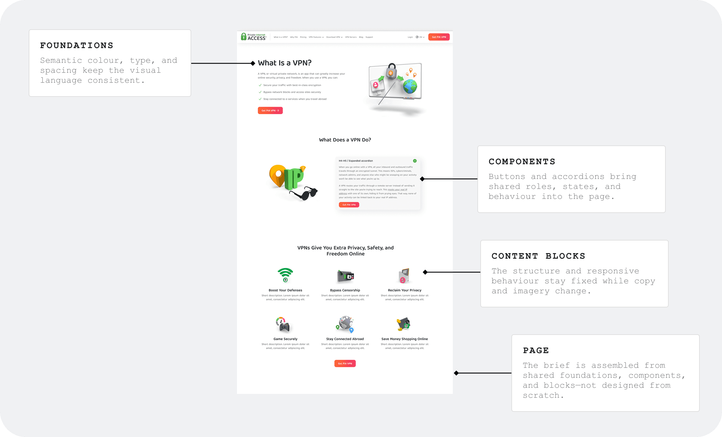
A live page brought the three layers together: foundations controlled the visual language, components carried their behaviour, and content blocks protected the reading order. The page could use different copy and imagery without rebuilding the design decisions underneath it.
Adoption
Adoption was built into everyday work
Publishing the library was only the beginning. With 30 designers working on pricing, checkout, landing pages, and CRO experiments, the system had to support daily work and continue changing with it. We made it the default starting point, then created ways for teams to ask questions, identify gaps, and improve it through real projects.
Start from the shared system
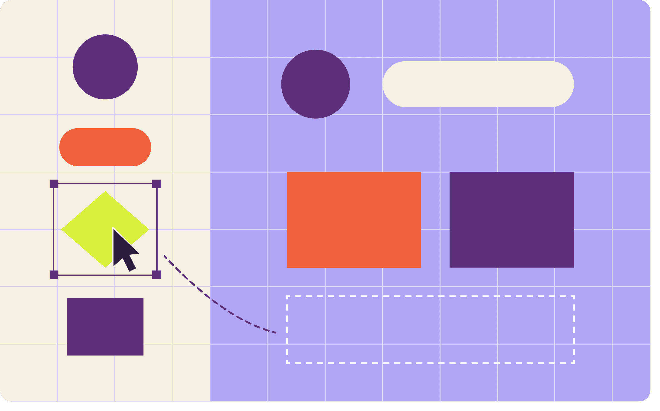
Designers started each brief with an existing component or content block instead of copying an old page. Shared structure, behaviour, and responsive rules were already in place, so they could focus on the needs of the project.
Make help easy to reach
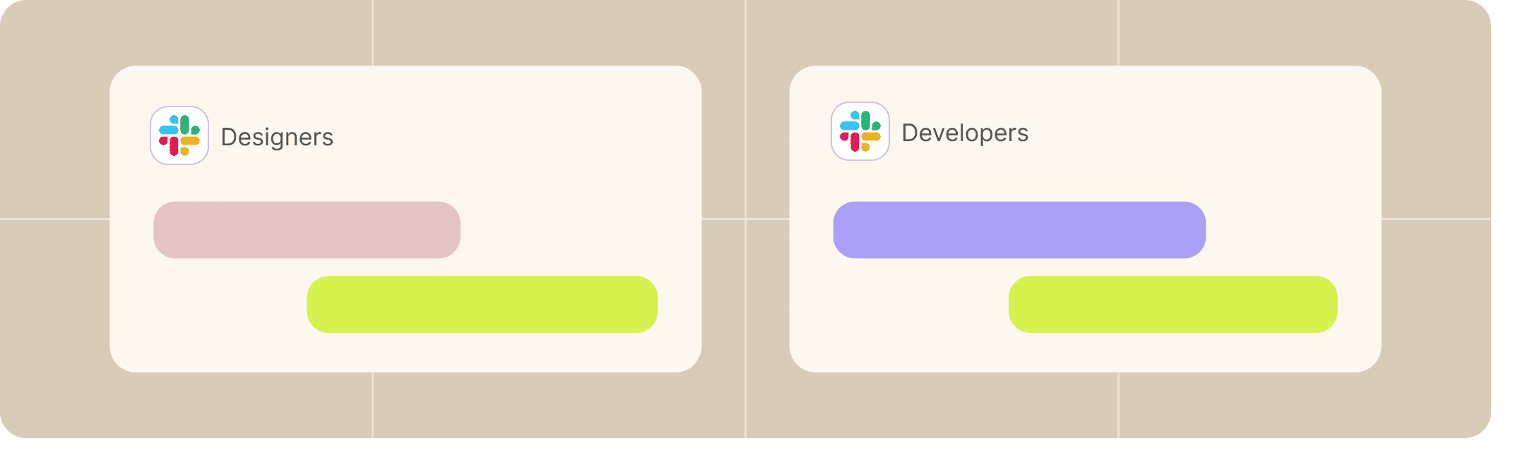
Separate Slack channels gave designers and developers a place to ask questions and raise issues. We communicated changes as the library evolved and ran workshops to help designers understand not only what was available, but when to use it.
Let real work show what was missing
Pricing, checkout, landing pages, and CRO experiments revealed where the existing library was enough and where it was not. Design critiques and product reviews helped us identify incorrect use and missing needs while the brief was still active, before the design became expensive to change.
When a gap appeared, the maintainers worked with the designer and developers who found it. Together, we checked whether the existing system could support the need and discussed the implementation and maintenance cost of introducing something new.
Keep experiments local until the need repeats
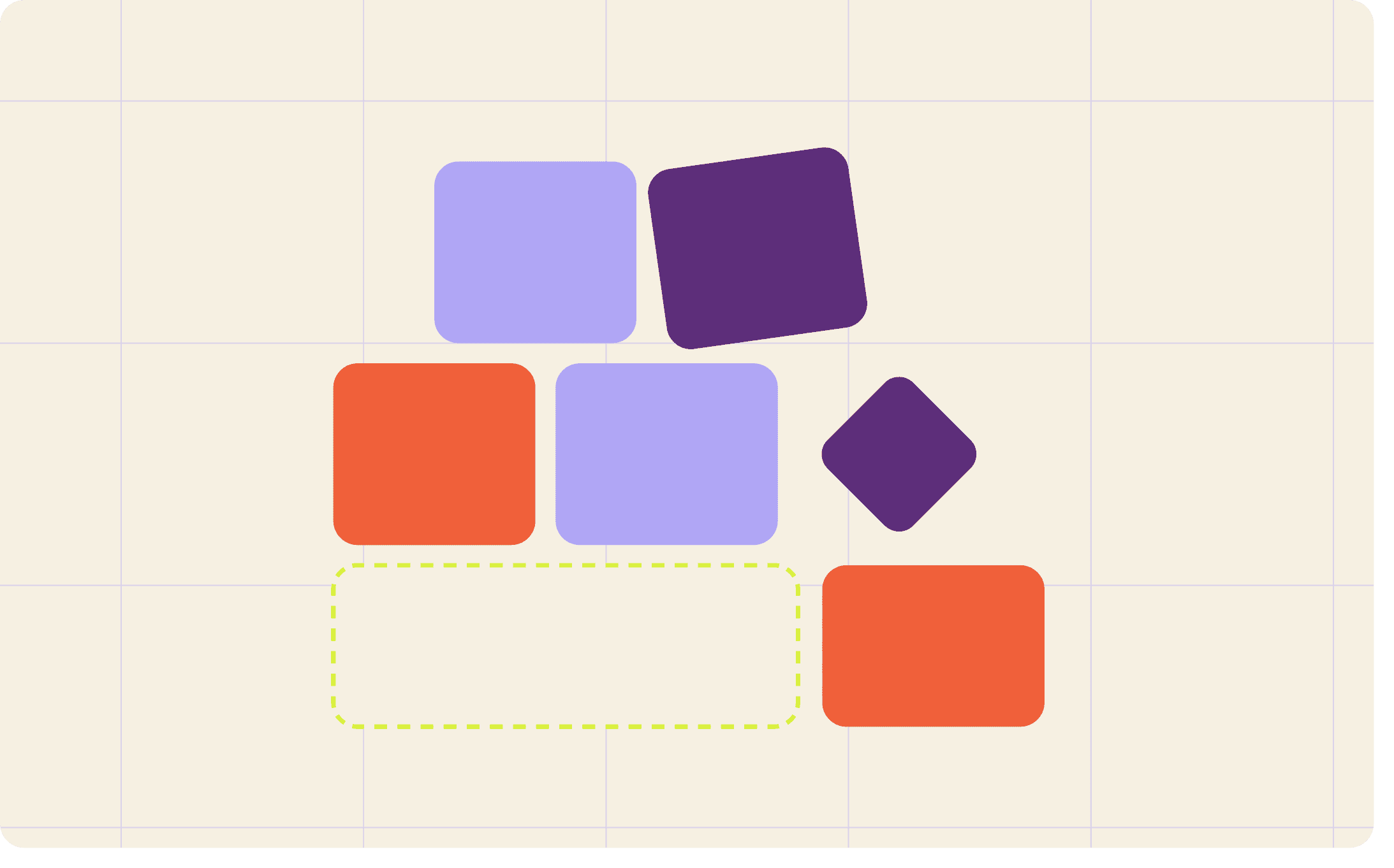
CRO experiments often required a treatment that did not exist in the system. We built it locally for the test, using shared foundations and components where possible. If it remained specific to that experiment, it stayed local. When the same functional need appeared again, we reviewed it as a shared variant so future projects could start from the improved system.
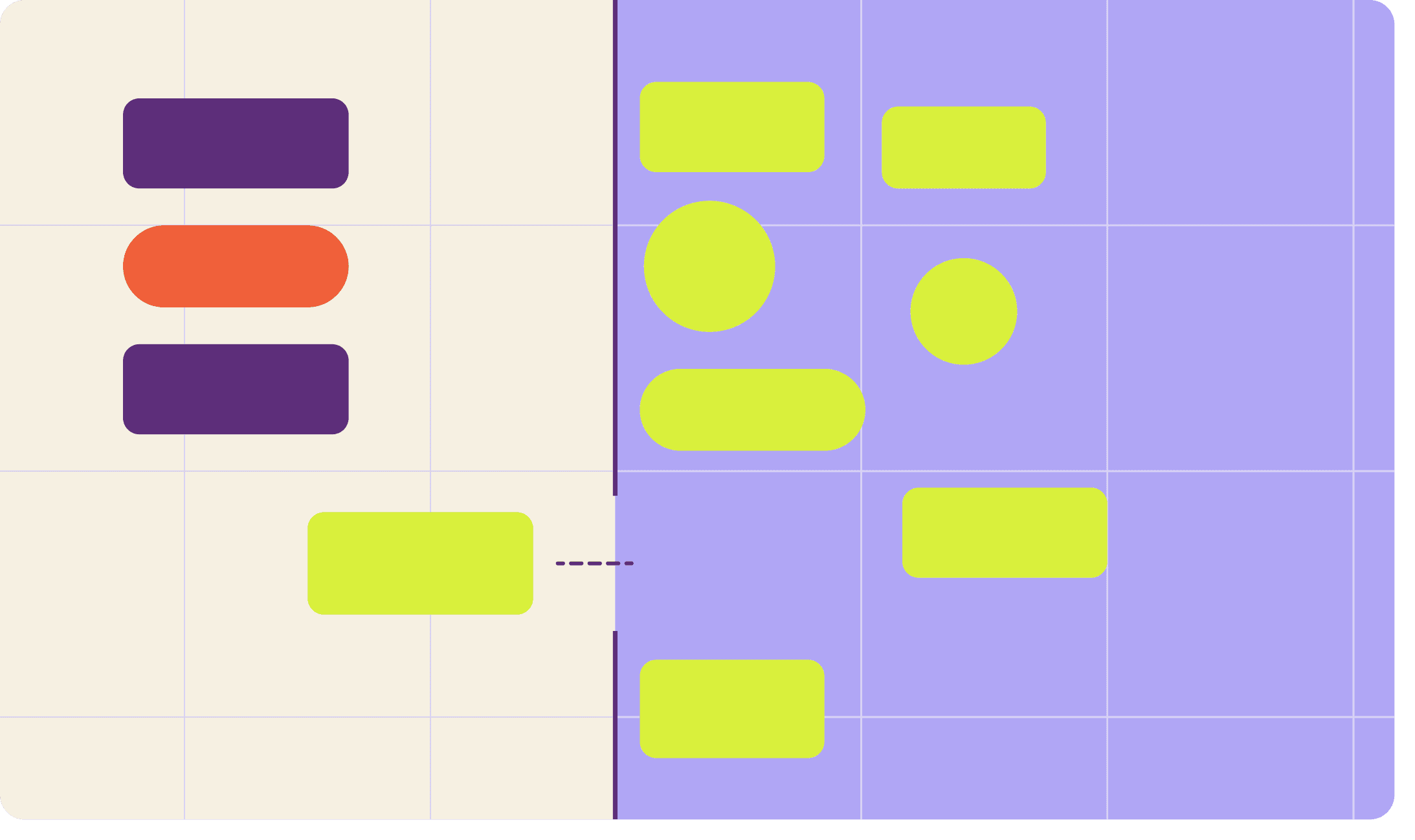
Adoption did not come from policing the system. It came from making support, context, and consequences visible.
Next
Next: connect design, code, and teams
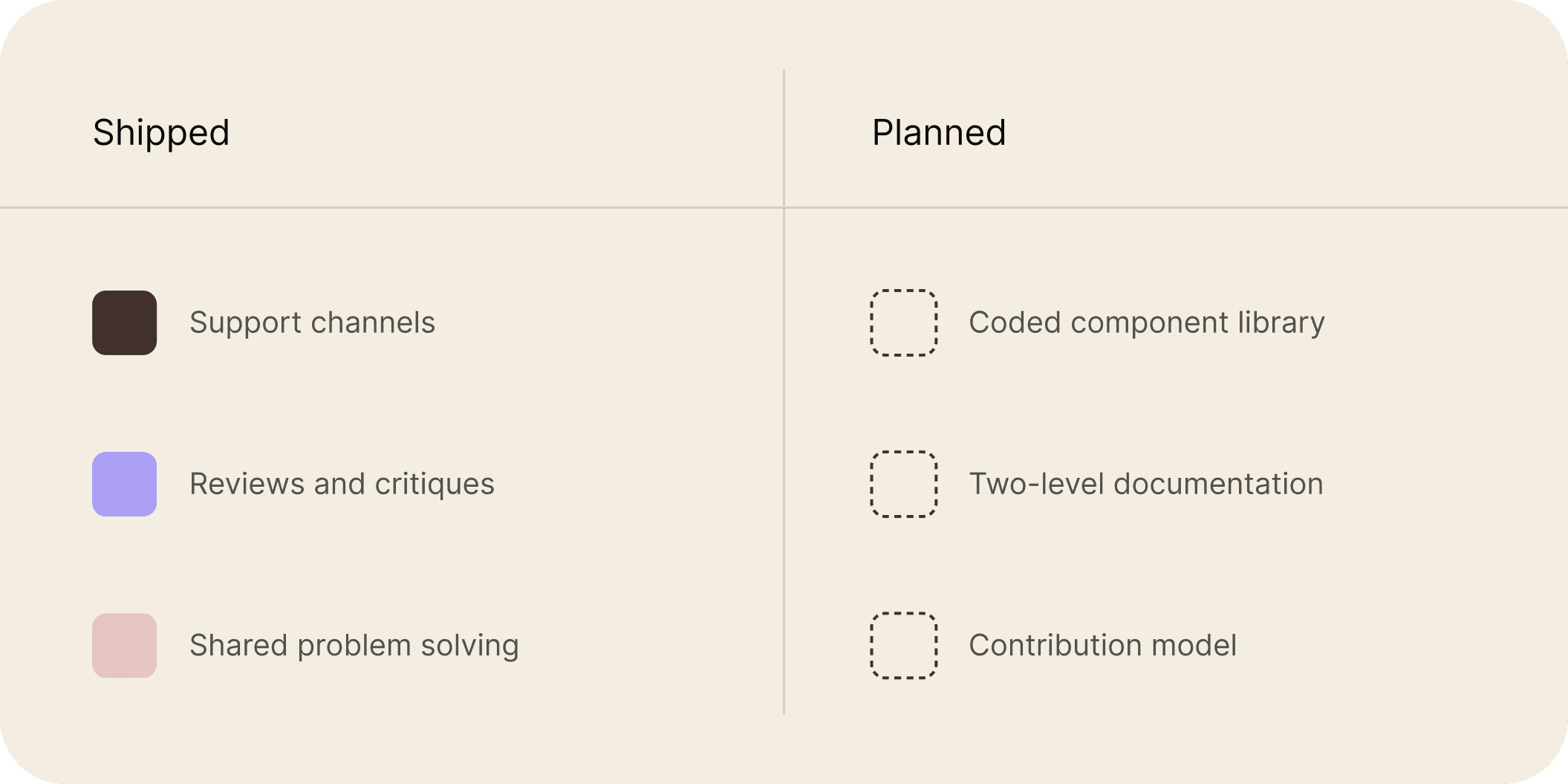
The first release gave designers shared libraries and the support needed to use them. The next phase was planned around stronger alignment with development, clearer documentation, and more involvement from the teams using the system.
Align design and code
We planned to build a coded component library alongside the existing Figma library, establish shared terminology for components and properties, and introduce PR reviews to keep implementation aligned with the system.
Document for different users
The documentation would work at two levels: short guidance for designers choosing and using a pattern, and deeper technical documentation for the people designing, developing, and maintaining it.
Bring teams into the system earlier
Consultation at the beginning of a project would help teams find existing solutions before designing new ones. A contribution model would allow teams to bring recurring needs back into the shared system, with the maintainers helping turn project-specific work into reusable patterns.