Intego
2024
Intego Website Redesign
Redesigning Intego’s website around a clearer product story, stronger trust and a more consistent path to purchase.

Overview
From a fragmented product experience to one clear story
Intego is a cybersecurity company specialising in protection for Mac users.
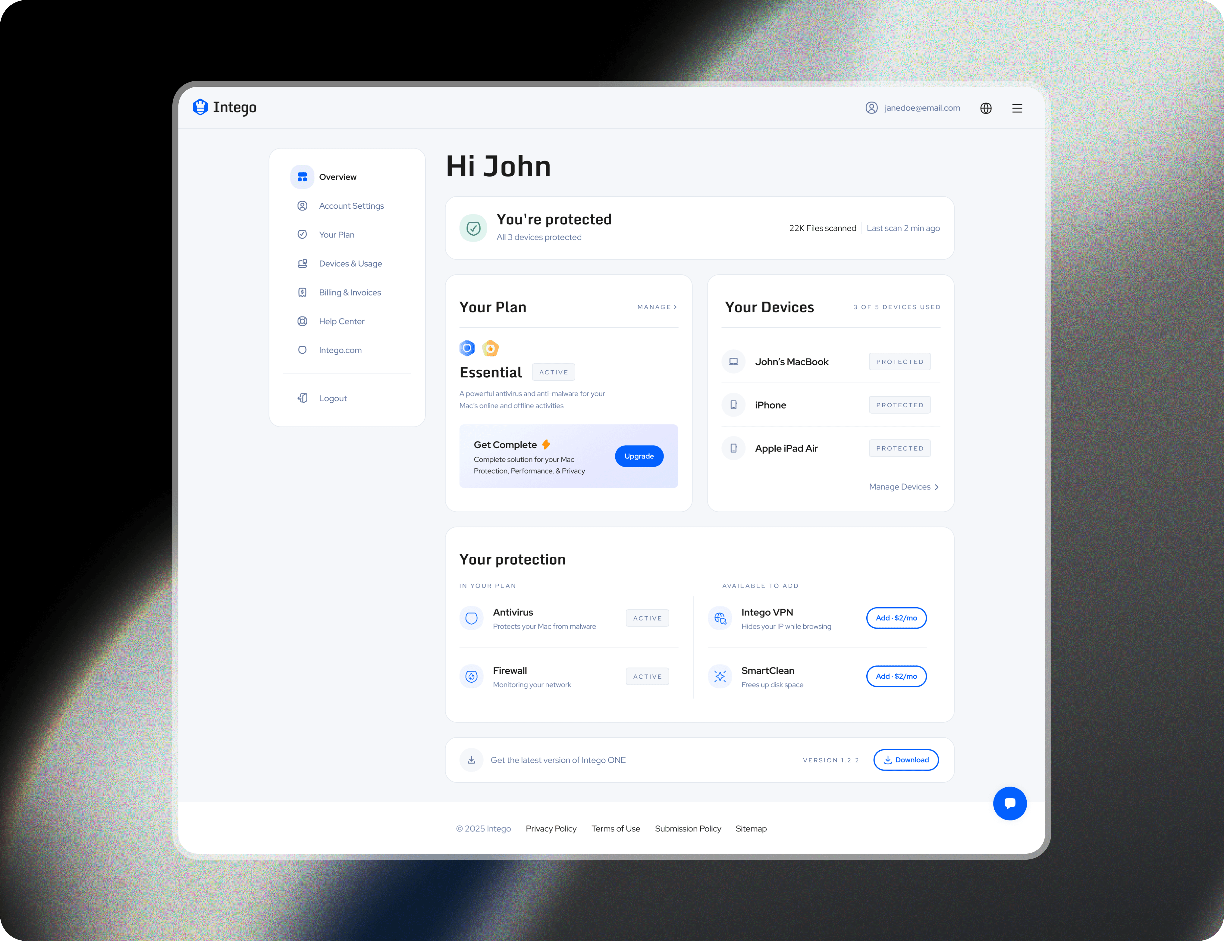
As the company moved towards IntegoONE as its flagship offering, the website still reflected a fragmented product structure. Different products, bundles and purchase journeys competed for attention, making it harder for users to understand what they were getting and how to choose.
The redesign was an opportunity to rethink the experience from the ground up: clarify the offering, strengthen trust and create a more consistent journey from discovery to purchase.
The Challenge
The website had grown more complex than the product story needed to be
01 / Product clarity
Multiple products and overlapping bundles made it difficult to understand what Intego offered and which option was right for the user.
02 / Trust
Important proof points were either weak or appeared too late, while product claims were not always supported by clear evidence.
03 / Purchase journey
Pricing, discounts, upsells and checkout behaviour changed depending on the path users took through the website.
Design
Designing approval workflows
Rather than treating approvals as isolated actions, I focused on creating a connected workflow system that brought requests, budgets, policies, and reporting into a single experience. The goal was to help finance teams understand what required attention, track progress across departments, and make decisions with greater confidence.
The final solution introduced dedicated approval workflows, budget governance tools, approval rules, activity history, and operational insights designed specifically for growing organizations.
Centralized approval dashboard for reviewing requests, tracking statuses, and reducing delays.

Designed a streamlined approval dashboard for faster reviews and decision-making.

Improved approval management through clearer workflows and request visibility.
Reflection
Designing for operational complexity
This project highlighted the difference between designing for individuals and designing for organizations. While expense tracking focuses on visibility, financial operations depend on coordination between people, teams, and processes.
The most impactful improvements came from making responsibilities, approval states, and next steps visible throughout the workflow. By reducing ambiguity and creating clearer pathways through the system, the experience became easier to navigate while supporting significantly more complex organizational needs.
This feels much closer to the style and depth of your Polaris case study while still being noticeably shorter.